 These happy people graduated today!
Photo by Laura Bennetto
 I’ve clearly got carried away with Google’s new corpus analysis tool. Here are timelines for Garamond, Times New Roman, Gill Sans, Univers, Helvetica, and Arial in British English.
 Google’s new ngram tool shows how the word typeface is losing ground to font.


 E. G. R. Taylor. ‘ “The English Atlas” of Moses Pitt, 1680–3.’ The Geographical Journal, 95, 4 (April 1940), 292–9
 Mathematical notation took many centuries to develop. By the mid-seventeenth century, the main operators that we know today were established, +, –, =, but the multiplication sign × had only been used since 1631, and the proportion sign :: is of similar vintage. So the list of symbols in this 1703 edition of Archimedes’ Elements of geometry may have been technically redundant, but would still have acted as a useful reminder.
Tacquet, Andrea. Elementa geometriæ planæ ac solidæ, & selecta ex Archimede theoremata. Cantabrigiæ: Typis academicis. Impensis Corn. Crownfield, MDCCIII [1703].
Oughtred, William. [Clavis mathematicae] Arithmeticae in numeris … Londini: Apud Thomam Harperum, M.DC.XXXI [1631].
Johann Heinrich Rahn, trs. John Pell. An introduction to algebra. London: printed for Moses Pitt. 1688.

 The very sick get spared the lengthy sermonizing, and those in peril on the sea are able to make their peace with their maker – quickly.

 However elegant this title-page from Christopher Plantin’s press may be, in 1583 it had a hard selling job to do. Nomenclator (‘dictionary’) is the title of this multi-lingual glossary ‘of all things’, organized thematically, but the largest type on the page announces that it covers ‘EVERYTHING’. This is the third edition: ‘much enlarged and corrected from the previous editions’ is the gist of the subtitle. Dictionaries are always announced as new and better than before. And of course the largest graphic item on the page is Plantin’s well established brand of the golden compasses. Fittingly for a classification of all human knowledge that is published in book form, the first section is about … words relating to books.
 This week’s visitor was Stuart Bailey, who presented some of his work under the Dexter Sinister label. Discussing publication/events in New York, Edinburgh, and Basel, Stuart demonstrated how his artwork/design is intended to set up frameworks that provoke writing, because writing can never take place in a vacuum, but must always have a form to fit into. Illustrated is the text to be read by an ‘elevator operator’ at the Whitney Museum, NYC, charmingly set in Johnston and Monotype Fournier.
 David Pearson demonstrates the magic of Tschichold’s redesign of Penguin book covers to an appreciative audience at the Department of Typography & Graphic Communication today. David was visiting MA Book Design students who are working on a paperback series project with Fraser Muggeridge.
 What must have struck seventeenth-century readers as a very positive declaration (‘I think so’) strikes the modern reader as at best an equivocation, at worst absent-mindedness (‘I think so’).
 (Visulization by ManyEyes)


 The impressive Fell types owned by the University of Oxford were not always used for imposing, learned tomes. They were also used for jobbing printing – they were the University’s Arial and Comic Sans as well as its Garamond Premier Pro and Perpetua Titling. Here’s an example of a piece of jobbing printing from 1672 (Madan 2932), set in leaded Double Pica (about 22 pt):

 Only two Labour leadership statements have arrived so far, and at this point a Miliband leads Ed Balls in the design stakes.
 The Woodstock Literary Festival’s website is currently under construction – so our old friend lorem ipsum gets another outing …
 And now I see the Dutch have rather nice square Wendingen/Rietveld/De Stijl-inspired numbers on their shirts.

 Congratulations – more typographers arrive on the market! At least two of these graduating BAs will join us as MAs next year.


 Shotguns required (still require?) material to be inserted between the powder and the shot, to prevent gases from leaking past the projectiles at firing. Gun-wadding was frequently torn-up waste-paper, whatever was to hand. As it was ejected with the shot, it could survive to provide much-needed evidence. In Charles Dickens’s Bleak House, Lady Dedlock is incriminated in the murder of the lawyer Tulkinghorn when detective Bucket discovers that wadding near the body is ‘a bit of the printed description of [the Dedlock’s] house at Chesney Wold’.
  This was the slogan LT used whenever they did something that the public would loathe, such as getting rid of trolleybuses. But in 1951 LT took its obligation to inform the public seriously, as its emphasis on the quality of its information design in this advertisement placed in the Festival of Britain Guide shows.
 Keith Tam’s second-year students from the School of Design at the Hong Kong Polytechnic University visited Reading today to see items from the Isotype collection and work by our MA students. Here they are looking at examples of Russian IZOSTAT charts.
 The new Rolls-Royce Ghost (yours for $245,000) features a start-stop button engraved with a stencil version of Gill Sans.
 Boris Johnson is the latest in a long line to discover the Roman handbook to electioneering, Quintus Tullius Cicero’s Commentariolum Petitionis: Chairman Boris’s thoughts are here.
 The new identity for the proposed merger of Continental and United Airlines features a seriffed typeface, Perpetua Bold. Back in the 1970s, when Negus & Negus designed a logo for the newly-merged British Airways, Dick Negus chose Plantin Bold to replace the sanserif BEA and BOAC logos. Dating from the 1990s, Newell & Sorrell’s Mylius still adorns British Airways planes. On the sanserif side, KLM and Lufthansa retain thier 1960s logos: F. H. K. Henrion’s extended grotesque and Otl Aicher’s Helvetica respectively.
 In this week’s TLS, Martha C. Nussbaum writes about the place of the arts in education, and bemoans the threat of education policy directed solely towards economic growth: ‘Citizens cannot relate well to the complex world around them by factual knowledge and logic alone. The third ability of the citizen, closely related to these two, is what we can call the narrative imagination.’
  The coming of the railways in the 1820s gave rise to a new world of reading: the timetable (of a coach service, for example) had previously been presented in the form of a list, with departure times from a public place, often an inn.
  I can almost hear the stage whisper: ‘Yes, we know “Knowledge Centre” is a silly name when we really mean library, and yes, it’s in the Green Building – you know, the one that’s green.’
 The appearance of the snake’s head fritillary is always magical in our garden – there is only a solitary example, it seems to appear from nowhere, and then disappear just as quickly. Its heavy head hides brilliant yellow stamens.
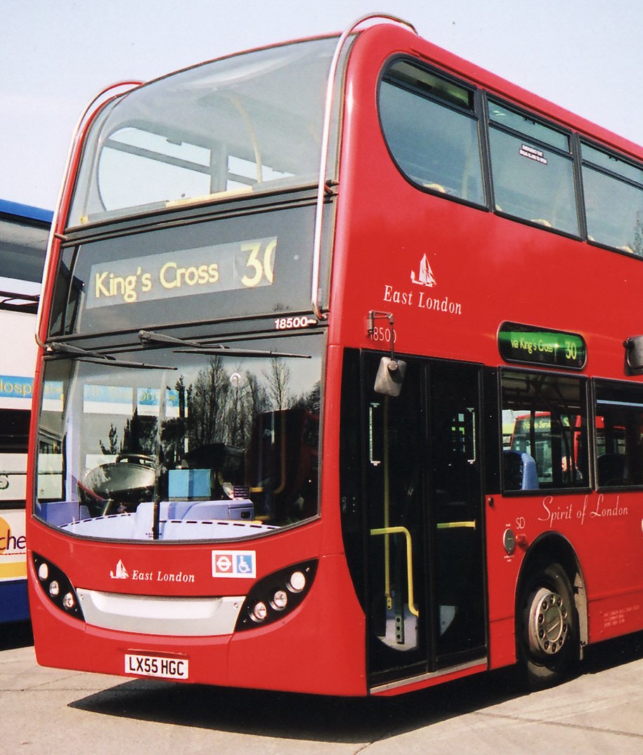 The well-rounded vehicle on the right is an Alexander Dennis Enviro400. Unfortunately the well-rounded exterior is not matched by a well-rounded interior – particularly with regard to the staircase. Why is it so easy to fall down a modern double-decker’s staircase, when it used to be so difficult in the days of rear-entrance buses?
 If you look at the plan of a London Routemaster, you'll see that the staircase is at the rear, at that the interior wall is curved, matching the curve of the exterior. You descend, first facing towards the rear, but then radidly turning to face towards the nearside. You can place your weight against the outside handrail, following the curve as you make your descent, working with the inertia of the forward-moving bus to keep you canted towards the side or rear of the bus all the time.
 On the sleek Enviro400 the staircase runs towards the back of the bus for most of its length (my photograph shows an Enviro500 in Hong Kong; for a UK vehicle see here). You start your descent facing the offside, that is you are working against the inertia of the moving vehicle. The panelling meets at a 90° angle, so there is no curve to lean against to transition from facing offside to facing towards the rear. Now you have a straight drop, facing to the rear in front of you, with the inertia of the bus propelling you down it. There is a correspondingly sharp angle to the panelling and stairs at the bottom.
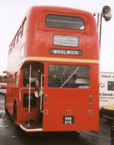 In short, in my opinion, the Routemaster stairs assist you in descending, the Enviro400’s actively work against a safe descent.