eBooks – linear, interrupted

I’ve been happily reading G. K. Chesterton’s The man who was Thursday on my iPad. Happily, because the only print edition I own is the 1938 Penguin edition, which is set in 10/11pt Monotype Times New Roman in a style which decided pre-dates Tschichold’s Penguin composition rules: extra spaces between sentences, no word division to help justification, spaced-off punctuation, etc. Print isn’t always lovely.

Using Stanza, I could format the Project Gutenberg text pretty much as I wanted to – with indents, not line spaces to separate paragraphs, the ability to alter line feed independently of face size; yes, I managed to format quite a happy page. The iPad choice of fonts is restricted but in this case, with little italic or anything more exotic in the text, Apple/HTF’s Hoefler Text looked ok.

So why did I enjoy Thursday when I’ve previously ranted about the typographic problems with eBooks? It all comes down to the configuration of the text.


Although a fantasy (‘nightmare’ is Chesterton’s description), Thursday is pretty much a standard prose novel. A few poetry extracts (we’ll come to those later), and more than a dozen chapter headings, but otherwise just paragraphs of text. No subheadings, no pictures, no lists, no tables, no notes. Using the schema devised by Michael Twyman to describe the possible configurations of verbal graphic language, the bulk of Thursday sits firmly in the category labelled ‘linear interrupted’.

‘Linear interrupted’ means that the text just runs on, in a linear fashion, within each paragraph unit. Paragraphs themselves are ordered in a linear sequence, with no differentiation. The ‘interruption’ is only imposed by the external constraint of the frame in which the text is composed – in metal, the text area formed by the page chase, in digital page layout by the text box and its margins, or the area available on the screen in which text can be rendered. Line breaks are arbitrary, and understood by the reader as such. The arbitrariness is reinforced in traditional print by the choice of justified setting, which neatens everything up into a block, so the only deviation from a regular left or right margin is the (meaningful) white space that indicates a paragraph start or break-line.

(Of course, many typographers argue that even word spacing – even at the expense of an aligned right-hand edge – is an even better indication of linearity, through the evenness of rhythm it indicates, than the squaring up of text. But these are just two ways of indicating to the reader that the stuff just runs on.)

And even in traditional typesetting, the idea of being able to reflow a text into a given space is a common one. Books are always being reset, reformatted, larger, smaller – my Thursday is, I’m sure one of dozens of typographic presentations of that text. But as a nearly pure piece of linear interrupted, it is eminently reflowable, and fits the reflow model of the dynamic-layout eBook very well. While every book designer thinks they have hit on the perfect page for their publication, you can’t deny the need for more than one solution.

So where does the reflow model break down? Well, even in Thursday, it breaks down whenever a paragraph isn’t a ‘normal’ one. It doesn’t have to, because the text could have attributes, or the text engine rules, that prevented the following problems:

Chapter heading becoming detached from the following text. Stanza doesn’t seem to observe keep options, or maybe the headings are not properly coded as headings – after all, the one defining attribute of a heading is that it belongs with what follows, not what went before.

Poetry being ‘over-displayed’. I mentioned that you could decide whether to indicate paragraphs by vertical space (staccato) or no space and indents (traditional, more linear). Well, you can for main text, but not for displayed text, which was coded/rendered with a line space between each line of quoted verse.

Hyphenation. I left this on, and most of the time it worked. It broke capitalized words, though, and didn’t seem to mind breaking a very short word (the hero’s name is Syme, or Sy- | me as it was often rendered). The text is also short enough to read in about 3 or 4 sittings, so the lack of headlines wasn’t a bother (Stanza doesn’t bother you with an over-intrusive ‘where you are in the book’ indicator, though you can see a percentage read if you want to.)

So far, the Stanza implementation of Thursday was, as I said, reasonably happy. Better than a cramped pre-war Penguin. But as you can see, even in this text, anything that verges out of the pure linear interrupted mode starts causing problems. Enlarging the type, I forced the lines of poetry to turn over. The turns align with the start of the line rather than indenting – but while this is not as good as a hanging indent, it is, I suppose, better than having the start of the line indented with the continuation full out, which would really blur the distinction between prose and verse.

You will also have noticed from the screen-shots that the quote marks are straight throughout this text, which is a pity given the generally good appearance of the type.

To conclude, Michael Twyman’s schema gives us a useful checklist of the configurations that demand spatially sensitive, rather than arbitrarily reflowing, presentation. A list (and you can define poetry as being more list-like than continuous prose-like) needs its list-iness preserved. Headings are also a kind of list, in that they have text nested beneath them which, if hidden, renders the headings as a list of contents. A play or poem with line numbers is not continuous prose, but some kind of matrix, where the alignment of rows across columns must be preserved if the text area is resized. One could go on. But I would argue that being more analytical about the configuration that the individual elements that a text contains will lead to better designed eBooks through better design of the composition rules that render them.

Michael Twyman, ‘The graphic presentation of language’, Information Design Journal, Volume 3, Number 1, 1982, pp. 2–22

Diagramming remembrance

¶ Two interesting articles here and here.
With acknowledgement to Jessica Hagy

Steve Jobs on design

‘Design is not limited to fancy new gadgets. Our family just bought a new washing machine and dryer. We didn’t have a very good one so we spent a little time looking at them. It turns out that the Americans make washers and dryers all wrong. The Europeans make them much better – but they take twice as long to do clothes! It turns out that they wash them with about a quarter as much water and your clothes end up with a lot less detergent on them. Most important, they don’t trash your clothes. They use a lot less soap, a lot less water, but they come out much cleaner, much softer, and they last a lot longer.

‘We spent some time in our family talking about what's the trade-off we want to make. We ended up talking a lot about design, but also about the values of our family. Did we care most about getting our wash done in an hour versus an hour and a half? Or did we care most about our clothes feeling really soft and lasting longer? Did we care about using a quarter of the water? We spent about two weeks talking about this every night at the dinner table. We’d get around to that old washer-dryer discussion. And the talk was about design.

‘We ended up opting for these Miele appliances, made in Germany. They’re too expensive, but that’s just because nobody buys them in this country. They are really wonderfully made and one of the few products we’ve bought over the last few years that we’re all really happy about. These guys really thought the process through. They did such a great job designing these washers and dryers. I got more thrill out of them than I have out of any piece of high tech in years.’

Wired, Issue 4.02, February 1996

¶ Thanks to Alison Black for pointing me to this article.

Understanding the past, designing the present

This was the presentation I gave at Researchers’ Night at the University of Reading on 23 September 2011

I’m a researcher in, and a practitioner of, typographic design – that is the way we present language visually on the written, printed, or electronic page and in the environment – and my main concern is how very complex texts, such as works of reference, can be made easier for the reader to use.
So I’ll talk about my work that is concerned with the history of English dictionary design, and how that connects with the design of dictionaries today; and also how looking at important early editions of the Book of Common Prayer led to the design decisions necessary when producing a scholarly text of the book for widespread publication.
Lexicographers, the people who write dictionaries, are very close to leading edge research in linguistics. Dictionaries in the popular mind are prescriptive – is it in the dictionary? – and there is an annual publicity fest when publishers announce which words are in (flashmob, crowd source) and which are out (charabanc, aerodrome). This is good fun, but it hides the real descriptive nature of dictionaries. Underlying every dictionary is information about the connections between words, about the patterns in language.
In Samuel Johnson’s day, this information was evidenced by the collection of literary quotations that he researched and collected. Today the evidence is contained in corpora, large collections of written, printed, and broadcast texts that have been transcribed and tagged so that they can be sorted and searched. Corpora have transformed dictionary making, allowing quantitative evidence to replace the lexicographer’s inevitably partial reading or prejudice.
Dr Johnson acknowledged the mutability of language – in his Plan of an English dictionary (1747) for the dictionary he implied he would ‘fix’ the English language (in a bid to obtain funding through the prospect of a concrete result), in his final Preface to the published work (1755) he admitted language was beyond fixing. Corpora can change with the use of language, and dictionaries can stay abreast of how we, the people, use words.
Johnson’s dictionary, of course, was reprinted and effectively rewritten many times in the century or so after its publication. And its presentation changed, too. Nineteenth century dictionaries developed a habit of presenting the supporting quotations – the actual evidence of usage – in smaller type, in order perhaps to save space. Looking back at Johnson’s original page design, we see just one size of type: and equality is implied between the evidence and the interpretation, and between the original authors and the dictionary maker: indeed, the author names, carefully arranged at the right of the column, can be seen as alternative access points into the text, balancing the capital headwords on the left.
I was able to use some of the insights gained by looking at Johnson’s dictionary when working on the Shorter Oxford English Dictionary and a range of school dictionaries. In the Shorter, it became clear that the compression of illustrative quotations into banks separated them – often by some distance – from the relevant definitions. The design task stemming from a decision to restore the link was to re-sequence the material in the SOED database so that a more immediate connection could be made.
The downside was that this system increased the number of paragraph breaks and therefore the number of lines the text occupied. To counteract this, we looked at the shapes of letters that were more amenable to being slightly condensed, that is made narrower. Gerard Unger in our Department has designed many fonts with a flat, horizontal join between vertical strokes and curved strokes, and it was this design feature that allowed the type to be made narrower without becoming less readable, and compensating for the extra lines – in fact the design allowed a considerable increase in the number of words to be contained without increasing the number of pages in the dictionary.
Another project concerned with adding real-language illustrative quotations, the design of the schools dictionary used the same approach to font choice, and also looked back to paragraphing structures in 18th and 19th century dictionaries. 20th century dictionaries were reviewed to consider features which unified or disrupted entries, in order to make it clear to the reader how the page was divided up into individual entries.
The Book of Common Prayer is one of the most important early modern texts that has survived to the present day. I was involved in the design of a new edition by Brian Cummings which contains three texts – those of 1549, Cranmer’s original transformation of the Catholic rites into a new but still transitional protestant form; 1559, the more firmly protestant edition that would have been familiar to Shakespeare and Milton; and 1662, the compromise between ritualists and puritans that followed the restoration after the civil war.
The typography of each of these individual printings is different: but, for a modern edition, they are similar in one respect: they are set in black letter, or gothic type. This is the type that was used for English language texts in early printing, whereas scholarly books, almost always written in Latin, were set in roman type. The aim was not to produce a facsimile, but to produce a text that was easy for today’s reader to understand, while allowing direct comparison between the three editions. Clearly the new edition could not be set in black letter. What became clear through consulting the original printings in the Bodleian library and on online sources was the distinct different in other aspects of typography: 1662 is altogether a grander affair, a real statement of a settlement of opinion and the victory of a particular approach to services in the Church of England. It is larger in format, has not one but two impressively illustrated engraved title pages, and makes use of large displayed roman type to divide the text into sections for each service.
This provided a starting point for the design solution. There are elements which are consistent between the editions – all divide prayers into those which are essentially dialogues between priest and people, and those said by the priest alone; there are readings directly from scripture; and there are ‘stage directions’ (how to perform actions or read prayers) and notes (what needs to be done to prepare the church, what the meaning of a service is, and importantly where there is scope for deviation from the text, etc.).
These common elements were given common typography between the three texts. In general, this meant that the headings, which are written very differently in the editions, could then carry come of the weight of indicating to the reader which text they were currently reading. It was decided to present these line for line, using the same type as the original, observing the quirkiness of word division and the frequent change, in the early editions, between black letter and roman. This in turn reflected the rather hasty production of the early editions, and allowed something of the grandeur of the presentation of the 1662 edition to come through.
The resulting design explains to the reader, I hope, something of the change in typography in this crucial period – a move away from the manuscript tradition of black letter, very compactly set, with an emphasis on creating shapes and gradations of size that do not relate to the logical structure of the underlying text – so that the biggest type on the page might be used for the least important word, and the emergence of a more rational approach which tends to emphasis the important words. This chimes with the editor’s decision to observe the original spelling, capitalization, and punctuation of the texts – which sounds alarming but is actually very easy to read.
I hope these examples show how historical research and an understanding of the techniques and practices of the past can provide a framework for thinking about contemporary design decisions, whether in presenting text more rationally or allowing the reader to appreciate some of the flavour and original presentation of an historical text.

In the grass, snake

This young grass snake appeared in our garden today, shimmying across a path, curling up and hissing!

Where to locate a Pile of Poo

If you’re looking for a bunny girl or a pile of poo, look no further than the new Unicode version 6.0, which, among many other more serious changes, now includes

1F46F 👯   WOMAN WITH BUNNY EARS
1F4A9 💩   PILE OF POO

You can now typeset Hugh Hefner’s fantasy or a steaming pile with the confidence that anyone around the world will be able to render your intent precisely – as long as someone designs a font with the right characters on the right code points.

Upper-case spooks

Do spooks type hunt-and-peck style, with the caps lock held firmly down? Do we shout at foreigners, typographically? Or is lower-case too democratic for dealing with a repressive regime? I think we should be told.

Image from the Guardian

Inside the weave

Laura Ellen Bacon is artist in residence at Compton Verney, and is creating a wonderful white tape cocoon among the interstices of some trees in the Capability Brown park. The work seems quite different from the woven forms she has previously produced: there is no inherent strength in the material, so the smooth inner compartment (an implied shell or nest?) is literally held in place by the tension of a multitude of tied lengths of tape, using the trees as anchoring points.

Starting off as straight lines, they are tensioned into curves by further attached strips in a way that is not dissimilar to the use of control points on bezier curves in type design. This results in a certain randomness from the outside, as the smooth internal effect is most clearly seen when you actually enter the structure – it’s big enough for two people to stand in comfortably. The work will last a season – perhaps more? Today it was the home of a young robin and a mouse (who did not stay around to be photographed).

More images here.

Digital focus

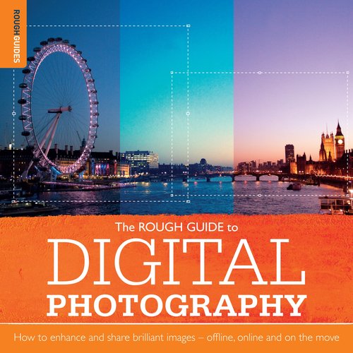
I’m looking forward to reading Sophie Goldsworthy’s new Rough Guide to Digital Photography. Look for the lovely images of Tuscany and Indian tea plantations on her website here.

Berating your client

Following on from the brief we’d all like to have received, here is the letter of desperation to the client that we’ve all probably composed in our head, but never sent. Augustus Pugin did send this letter, though, when his client had the temerity to suggest the addition of a gallery (a solecism in a Gothic church):

‘… here are no Less than 5 protestant archdeacons pulling down galleries of every kind, all the works of the Camden & oxford societies denounce them & now after I had ingeniously got rid of the organ Monstrosity your lordship proposes to erect a gallery in the only perfect revival that has been accomplished. what Can I say or do, the gallery would not hold 20 people if crammed full & it would utterly ruin the church. all the Learned men will flock to this church as a Model & then they will see this Monstrosity. what a miserable fate awaits every architect of this wretched country. I have Lived to see almost every building on which I have set my heart either upset or ruined & now a gallery at Cheadle. perfect Cheadle. Cheadle my consolation in all my afflictions. Mercy I entreat.’

Pugin’s client relented. The gallery was not built.

Rosemary Hill, God’s architect: Pugin and the building of romantic Britain (London, 2007) p. 268

Reading the signs

Rob Waller’s provoking piece in Eye and its associated illustrations on their blog raise interesting questions not just about reading buildings, but about affordance and consideration for the user in any typographic form.

Making the Prayer Book fit

Occasionally there is a need to make a new edition of a book, or a new setting, match an earlier one as closely as possible. Here is an excellent description of the problem as encountered by Peter Ducker, designer at CUP of a re-set Book of Common Prayer.

Restoring Scotland Yard to the Wright stuff

It’s worth quoting in full Ann Pillar’s excellent letter in The Times today (the lead, no less):

Form and function at Scotland Yard

Sir, The debate about form following function extends beyond the architecture of the Olympic velodrome (letters July 23 and 25). The design of the New Scotland Yard sign (by Edward Wright) is one of the nation's finest examples of form and function in design. Or was, until defaced by a pointless blue marketing plaque.

Wright's idea was that the sign, which announces New Scotland Yard and humanises its anonymous glass curtain wall face, should also symbolise the function of the Metropolitan Police. He designed the constantly revolving triangular shape and reflective steel lettering on three sides to be symbolic of the Met's constant vigilance in guarding our safety. The sign, which has never been copied, has achieved an iconic status worldwide.

It would be best to reunite the form and function of the sign by reinstating the original lettering. This would restore the sense of symmetry and balance to a piece of design that has become part of the fabric of our lives, equal in iconic status to Big Ben (used to represent government), and the finial figure of the Old Bailey justice.

Neither of these designs needs marketing, yet.

ANN PILLAR
Department of Typography and Graphic Communication, University of Reading

For more on Edward Wright, see here.

Virginia Woolf … cover designer?

I photographed these books in Virginia Woolf’s bedroom at Monk’s House, Rodmell, East Sussex. They are painted over an ordinary Methuen edition of Shakespeare.

Luna’s Café: The Next Generation

Legacies of Modernism
The State of British Poetry Today | 9-11 June 2011 | Université Paris-Diderot

Friday 10 June, 3.15 pm Panel 5
Joe Luna, University of Sussex: ‘All your poems are belong to us: reading internets in contemporary British poetry’

‘Is that an extra code for something? Cuz my generation doesn’t deal with direct sarcasm’ (Ryan Trecartin)

‘Access denied’ (Milton, Paradise Lost, IV. 137)

Is there a new digital humanism afoot in contemporary British poetry? My paper will explore this fecund contradiction by positing links between traditional Romantic notions of Immortality and Spirit (as evinced by Hazlitt and Shelley among others) with a new breed of poets for whom ‘Immortality’ is found in the multiple lives of computer game characters, and ‘Spirit’ becomes isomorphic with the Ghost in the Shell. In his Lyric Poetry and Society, Adorno states that ‘In industrial society the lyric idea of a self-restoring immediacy becomes – where it does not impotently evoke a romantic past – more and more something that flashes out abruptly, something in which what is possible transcends its own impossibility’; but where, in the truly infinite abstractions of digital society, can we locate this ‘immediacy’, and what are its implications for the poetic recuperation of humanity at the risk of absolute dispersion by the tentacles of late-capitalist alienation? Arguably the dialectics of internet culture and video-game mentality produce a collectivization of human subjects who at once recognize their humanity through the increasingly ‘realistic’ semblances of life such diversions procure, at the same time as they are removed from the ‘reality’ of active subjectivity and their interaction reduced to chat boxes and status updates. How are contemporary poets responding to and working in the motherboards of digital Pop culture? I will argue that works by Justin Katko & Jow Lindsay, Jefferson Toal, Mike Wallace-Hadrill and Jonty Tiplady produce varying forms of ‘.jpeg transcendentalism’ that flesh out in belligerent chrome an ‘intense inane’ (Shelley) that instead of ‘impotently evoking’ a Romantic inheritance, recuperate and détourn the ersatz affirmation in digital culture precisely in order to transcend its own impossibility.

A new PhD studentship opportunity at Reading

This AHRC Collaborative Doctoral Award Studentship is suitable for UK/EU applicants:

The Typeface Designs of Eric Gill

University of Reading – Department of Typography & Graphic Communication
St Bride Library, London


An AHRC Collaborative Doctoral Award studentship (fully funded fees and maintenance) between the University of Reading and St Bride Library, London is available to a suitably qualified UK or EU student.

The period in which Eric Gill's typefaces were first manufactured was the golden age of hot metal typesetting and Gill himself is arguably the most important British typeface designer of the twentieth century. However, as an artist he did not have the necessary technical knowledge of type production and so craftsmen and engineers also played a role in manufacturing Gill's typefaces. This research will document the complete body of Gill's work as a typeface designer for the first time; explain the role he played in the conception and manufacture of each of his designs; evaluate the impact of hot-metal typesetting technology on Gill's typefaces and investigate the extent to which this was carried forward into subsequent versions which were produced for photocomposition and digital typesetting.

In addition to extensive archival research at St Bride Library this doctoral research will draw on the archives of the Monotype Corporation Type Drawing Office held by Monotype Imaging, and of Ditchling Museum.

Closing date for applications: 24 June 2011

League division one

League tables tell you anything you want, but it’s still nice to see Reading ranked number 4 in the country for art & design in the Complete University Guide.

Food, glorious food …

… is nowhere to be seen on Coralie Bickford-Smith’s new Penguin covers.

A top ten logo from Reading

Nice to see Ian Dennis's National Theatre logo has been voted by readers of Creative Review as one of their top ten favourites.

Ian worked on the project in 1974, and it has been featured in the April issue of the graphic design magazine, alongside Michelin, World Wildlife Fund, and Woolmark. His logo beat those of Apple, NASA and the London Underground to number ten in the top twenty list.

Ian, who now runs Indent Design in Reading, graduated in 1973 in Typography and Graphic Communication and almost immediately went to work for legendary Dutch designer FHK Henrion. ‘Henrion had been working on a design but had to go to a conference, so he asked us all to have a go.

‘He'd created a Union Jack design made up of triangles and I could sort of see a ‘NT' in it, but I worked up something at home in Letraset, then developed it by hand after suggestions from Henrion.’

The logo is still a feature of the Theatre's publicity and the South Bank site. And I agree with former National art director Michael Mayhew about why it has stood the test of time – ‘because it is so beautifully simple.’

Swiss hit

What our Part 2 students get up with Sara Chapman. Enjoy!

Typography is about reading – and so are ebooks

Amazon’s latest UK Kindle ad shows how little care it takes over the typography of the ebooks that it hosts. This is their latest full-page ad in the Guardian. I can just about forgive the opening words in ALL CAPITALS, because, although letterspaced SMALL CAPITALS are much nicer, even William Morris resorted to chapter openings in the all-up style. The real give-away is the confusion of the hyphen with the dash. My first reading of the opening sentence assumed a Joycean style, mimicking ‘riverrun, past Eve and Adam’s’, followed by ‘doubt-but’ (what a disbelieving goat does?). But no, I was supposed to read those tiny, close-up horizontal marks as dashes – and then the parenthetical clause should become clear. Except it doesn’t. And William Boyd is a parenthetical stylist, a major dash-monger, with three on the opening page of Ordinary Thunderstorms, all decisively mangled by Kindle. He also believes in the use of the hyphen when creating compound adjectives: ‘pale-faced’, ‘even-featured’, ‘charcoal-grey’. Oh dear, they get mangled too, as Kindle thinks that they are non-breaking hyphens, and so studiously avoids correctly justifying the line preceding them to ensure that the compounded words are not (as they should be) divided by a line break. Here by the way is the printed original:

How can so little care be given to the presentation of text on a[n electronic] page? Do publishers care, or even realize, what is happening to the texts they lovingly commission, copy-edit, and proof-read, when they enter the electronic domain? 
I wonder, especially if they sub-contract the ebooking of their print files to Amazon, rather than apply quality control themselves. Here, for example, is a complaint on Amazon about a student edition:
‘The reason for the poor review is not anything relating to the translation, but the rendering of text not only in this book, but many of [this publisher’s] translations released in this series. The main problem is that the text is not rendered in a clean manner, so that, for example if you highlight “Livy” in the introduction of this text it is rendered “Liz7"” when you look under “highlights and annotations”. This means that if you search for “Livy”, your search will not find this word. This has been a constant problem in a number of this publisher's books. I have contacted them about the issue but have received no response. I would recommend [another publisher’s] text which provides a clean rendering of the text as well as hyperlinks to the footnotes which this publisher does not provide.’
The image below is not from the text criticized, but shows what happens when a printed book is scanned, word by word, to produce a searchable PDF. 
And the original print edition:
Note how the running headlines, which orient the reader so successfully in the print edition, are very little use in the ebook.
Not that other publishers are blameless: the following screenshots are from an edition of the Canterbury Tales, where we can see
  1. headings not identified as such, because they do not ‘keep’ with the following text; 
  2. headings (such as ‘NOTES’ which are at the wrong level in the heading hierarchy;
  3. misaligned note cues causing text misalignment;
  4. verse not correctly formatted, so that a turn-line does not indent, nor does the start of a line assigned a line number align correctly.


And here is the original printed page, showing text and notes simultaneously:
But at least this edition of Chaucer has line numbers. Another publisher's edition of Wilde simply omits them, leaving the reader floundering helplessly in relation to a citation in any other edition or critical text, or indeed in relation to the edition’s own notes, which are identified by line number, but are not accessible by hyperlink from the text.


Let’s look at the original print edition, and see how effectively the reader is oriented by indentation, headlines, line numbers, and page numbers; and how easily one can look up a note at the back of the book, and know where to return to in the main text.


In comparison with the inadequacies of consumer electronic texts, printed books are still miracles of compact, considerate texts that care for their readers, and how they are used.

Edit

Here’s an interesting link to a TeX implementation of justification on a Kindle.

Edit 2

Thanks to all the readers who picked up my misreadings and misspellings.

Use ’em, don’t pin ’em on the wall

Paul Shaw’s careful explanation of why it’s dangerous to fetishize fonts.

Reading the news in Arabic and Persian

Titus Nemeth’s excellent Nassim font is now used on the two major middle-east news sites run by the BBC, the Arabic and Persian services. And here’s a link to the BBC’s global visual language with its specific focus on typography as the primary design element.

Reading the papers

The publications of the Simplification Centre during its time at Reading can be downloaded here.

Paul Stiff and what interests typographers

Re-reading some of Paul’s writings since his death (see Robin Kinross’s obituary), this perhaps-overlooked piece in Typography Papers (because it was a ‘response’, not an article in its own right) seemed to sum up some provoking views about what should interest typographers.

‘… typography is far more about configuring and positioning characters than about the shapes of characters. A theory of writing and typography based solely on the construction of letters, allied to a view of reading which looks no further than ‘legibility’, is like traditional linguistics in which nothing much of interest happens outside the sentence.

‘From the telescopic perspective of information design the challenging problems of today are not connected with what type designers and typographers do or do not do. This is because most designing is done by people who are not professional designers and who get no help from professionals. Some digital typographers have tried to solve the problems which non-designers face by devising ‘automatic typography’ systems which do the designing work. The aim of these systems has been to design documents as they are written. The idea is to let authors get on with their writing, and let the designing take care of itself: so all that authors have to do is declare, as they write, that this bit of text is a chapter heading, and this is a list, and so on. Realizing the idea means that a ‘meta-document’ has to be designed before any real document is written. Designing a meta-document entails prefabricating a whole repertoire of graphic formats for text elements (‘chapter heading’, ‘list’, ‘subheading’, ‘caption’, and so on) which visually represent the whole range of text elements which may occur in any text which has not yet been written.

‘This is different from what professional typographers normally do: design texts after they have been written. Here there is an obvious parallel with lettering and type design: the fifteenth-century revolution in ‘automatic typography’ systems led for the first time to sets of letters, and their spatial relations, being designed before the texts in which they would be used were written.’

Typography papers 4, 2000, pp. 92–133.

Royal wedding blues

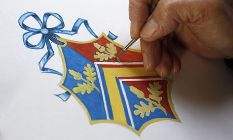
Heraldry is an aspirational art: if you don’t have a coat of arms, you might like to think that some day you will be granted one, or that perhaps some long-forgotten ancestor indeed was. Michael Hancher suggests that this is one of the reasons that heraldic terms are illustrated so frequently in early (and even recent) dictionaries: being a gentle(wo)man involves understanding the arcane meanings of a blazon (or even what a blazon is).

So the forthcoming royal wedding makes even the Guardian anxious to inform us of the exact meaning of Kate Middleton’s new armature (she won’t be fully armed till she’s married, if you see what I mean). The explanation brings in another English obsession, punning. But it also usefully reminds us how we've got our colour–gender assignment twisted over the years. Middleton’s lozenge is suspended from blue ribbons as a sign that she is an unmarried daughter: blue for a girl, perhaps because of the traditional association with the Virgin Mary, who is often depicted wearing a blue mantle.


Hancher, M. 1996. ‘[The Century Dictionary:] Illustrations,’ Dictionaries, 17: 79–115.
—— 1998. ‘Gazing at the Imperial Dictionary,’ Book History, 1: 156–81.

A lexicographer’s retreat

We can’t see the blue plaque, but thanks to Google Earth we’re able to see the house that lexicographer, missionary, and amateur astronomer Robert Hunter built for himself on Staples Road, Loughton, Essex in 1882. It faces Epping Forest, and the garden looks down the Roding valley.

Epping Forest District Council’s conservation area report includes the following:

‘7 Forest Villa was built (as Forest Retreat) by George Beckett in 1882 to the specifications of Dr Robert Hunter who was a Scottish missionary and lexicographer. Hunter compiled most of his 14 volume Encyclopaedic Dictionary (1879–1897) and his Bible Dictionary (1893) in the house. The former being the biggest before the Oxford English Dictionary was released. Hunter used the house not only as his residence, but as a place of refuge for sick children from the Victoria Docks. He died in the house on 25th February 1897. There is now a blue plaque is visible on the house.

‘The appearance of the house is severe; being a Scottish-style detached house, twin double bayed, the bays splayed, with brick piers and stone dressings. The house is built of Woodford red brick, tuck-pointed, under a steep slate roof. Arranged on the half landing principle to take advantage of the hillside site, the rear rooms are about 5ft lower than those at the front. There is a prominent central belvedere, where Hunter conducted astronomical investigations. The house has tall chimney stacks and original doors, shutters, and windows throughout. The front door has never been pierced for a letterbox, and the mechanical bell pull, still in operation, and all other door furniture are original. The rear elevation is plain, all redbrick, with burglar bars to the original ground-floor sash windows. The original clinker-built timber lean-to laundry room was added in 1970 and is hardly visible from street. There is an ugly but concealed 1950s garage. The interior contains most of the original fittings. The garden covers a quarter of an acre, replanned in 1930s by Reginald Lloyd. There is an Edwardian greenhouse and a lattice fence to front. The street aspect is identical to that at the date of building.’

Why is Hunter important?

The earliest use of bold headwords in a major English dictionary appears to be Robert Hunter’s The Encyclopædic Dictionary (originally pubished by Cassell, later published by Edward Lloyd) which appeared in parts from 1879. Hunter’s page is a remarkable precursor of Murray’s OED layout: bold lower case is used for headwords, senses are divided using a ‘branching’ numbering system, and each sense within the hierarchy begins a new paragraph.

The Encyclopædic Dictionary is generous in its use of space: a hanging indent is used for headwords, numbered sense paragraphs begin with a further indent, and a half-line space separates each entry. The clarity of the innovative all-lower-case bold headwords is compromised by the addition of light en-rules to indicate syllabification and diacritics to indicate pronunciation. The headline shows the first and last new headwords on the page, separated by an em-rule. Bold is used for the major sense-division indicators, and subtle semi-bold numerals are used for numbered senses. Overall the use of metalanguage is systematic and analytical. Italic is used consistently for register, subject field, and grammatical labels (slang, Naut., Transitive). Register and subject-field labels introduce the relevant sense, rather than being part of the wording. Illustrative quotations are set in the conventional broken-off style, but this disrupts the page minimally, as there is already considerable vertical fracturing of each entry.

Hunter’s division of senses, however, has none of the rigour or economy of Murray and certainly lacks the simplicity of Johnson: entries disintegrate into columns of paragraphs numbered with finer and finer grades of senses (‘Each word has been sub-divided as far as possible into the various meanings which it assumes at different times.’ – Preface, p. ii). Phrasal verbs, though displayed in full, are particularly difficult to locate, as italics rather than bold are used for these. It is easy for readers to lose track of the hierarchy of sense-divisions in a long entry.

Extract from my article ‘Clearly defined’ in Typography Papers 4, 2000, p. 56

Is Fagin buried here?


Holy Trinity Church, Clapham, may be the burial-place of the man who gave his name to Charles Dickens’s character in Oliver Twist. Fagin, his name phonetically remembered, was the boy who took the young Dickens under his wing while working at a boot-blacking factory in the early 1820s. This week’s TLS, taking an article by Peter Rowland from Dickensian Digressions, a book scheduled for publication by the Academica Press in the spring, reports an interesting conjecture:

‘But there also appears in those parish records one entry which could well be crucial. The name “Fagin” has been already discounted in our search. If we also discount the name “Fagan”, and cast our net a little wider, we find ourselves confronted by a Robert Fegen who could very well be our man. Again, the actual pronunciation of this name makes it totally indistinguishable to the ear from either Fagin or Fagan.

‘The Robert Fegen in question was born in 1804, which makes him eight years older than Dickens – and we are searching, it must be remembered for someone who was “much bigger and older” than the “young gentleman” who had just started work in the blacking factory. Fegen would, in fact, have been nineteen years old in 1823 but he had not yet formally come to man's estate and it would be pardonable for Dickens, recalling these events twenty-two years later, to think of him as a “boy”, albeit a rather large one.

‘It is not known what career Robert Fegen was following when he married Sarah Elizabeth Love at St Mary’s church, Lambeth, on October 23, 1827. They lived in Bromell’s Road, to the east of Clapham Common. Sadly, their married life lasted little more than five years, for he died on April 29, 1833 at the age of twenty-nine and was buried at Holy Trinity church, Clapham.

‘At this point, pending the discovery of further information, the hunt comes to an end. There seems a very strong likelihood that Bob Fegen is the young man for whom we have been searching, but no way of establishing this beyond an absolute shadow of a doubt.’

David Farkas

David, Professor at the University of Washington in Seattle, visited today to talk to MA students about strategies for providing readers with summaries and synopses of extended texts, including QuikScan and SwitchBack.

Pretty ugly

The paper by Diemand-Yauman, Oppenheimer, and Vaughan, ‘Fortune favors the bold (and the italicized)’, made it to the Today programme on Friday, courtesy of Jonah Lehrer of Wired. This paper reports two linked studies investigating the claim that a degree of disfluency in documents (put simply, making them harder to read) leads to improved memory performance.

Its findings have been reduced to ‘ugly fonts help you learn’, ‘typographic history is wrong’, even ‘Kindles are bad for you’, but I’m sure these leaps are not justified by the paper itself. As someone who thinks that good typography consists of good writing that is well articulated, well set, and properly printed (or presented onscreen), I find the concentration on the ‘magic bullet’ effect of a typeface change worrying. Setting your text in Caslon won’t make you write like G. B. Shaw, despite the Shavian insistence that his works be set exclusively in that typeface.

First, let’s look at the typefaces that the investigators considered disfluent: Comic Sans, Comic Sans Italicized, Bodoni MT, Monotype Corsiva, Haettenschweiler (similar to Compacta Bold). The first experiment compared Arial with Comic Sans Italicized and Bodoni MT. It isn’t clear from the paper whether the italic or roman version of Bodoni MT was used – one of the problems is that we are only shown two example stimuli from the first experiment, and none from the second experiment. For an investigation in the effect of visual presentation of text, this is a pretty big omission.

With the exception of Haettenschweiler, all these fonts are near normal in weight and proportion. Comic Sans may be the butt of jokes and typographic snobbery, but its letterforms are clearly within the norms of the western type canon. Monotype Corsiva might appear ‘arty’ to some but again it isn’t really a leftfield font. At first sight Haettenschweiler is – at least it has normal letterforms emboldened and condensed to a very abnormal degree for a text face – but on reflection it’s a fairly conventional font for newspaper headlines. So while a longish text in Word might be really difficult, a short bullet-pointed list, or a straightforward PowerPoint slide might not be so problematic. But there’s a special problem with Haettenschweiler, which we’ll come to.

For experiment 1, we know that simple, comparable texts were set in 16pt Arial, 16pt Comic Sans Italicized (60% greyscale), and 16pt Bodoni MT (60% greyscale). I’ve recreated one of the experiment 1 texts in all the typefaces tested in both experiments (I’ve sloped the Comic Sans by 12 degrees).

Different (from Arial) the variant fonts may be, but I would contend that they are not ‘ugly’. Screen resolution may improve or degrade the effect of tinting the type, but these variants are well within the norms of screen display and print production. (Remember Haettenschweiler and Monotype Corsiva weren’t used in experiment 1.)

Experiment 2 set school learning materials in the ‘disfluent’ typefaces. The process isn’t described very fully, because we get no idea of what the documents (Word and PowerPoint) looked like to begin with, or how much text they contained. We are told that one teacher objected to the use of Haettenschweiler because it was ‘difficult to read’ – Comic Sans Italicized was immediately substituted. We are also told that ‘the font size of the supplementary material was not changed unless the size coupled with the disfluent font made the text illegible as reported by the teachers or the experimenters, in which case the font size was adjusted to allow legibility’ (my italics).

The tables in the paper demonstrate the statistical basis of the claim that the disfluent presentations were more memorable to students. But they don’t break down the results by document type and font. When questioned on their feelings about the material they read, the students reported no discernibly different responses to the materials they were presented with, and that this ‘lack of observed liking/motivational differences between fluency conditions is unlikely to be due to insensitivity measures.’ (This strikes me as very odd, because the work done by Sue Walker demonstrates that schoolchildren can articulate their responses to typographic presentation very clearly.)

So what might we conclude from this paper? Its conclusion is that ‘small interventions have the potential to make big improvements in the performance of our students and education system as a whole.’ What they have found is that changing a document from a typographic default, a norm, makes for an improvement. That somehow doesn’t come as a surprise to me: Arial was designed to look like Helvetica, not to be the ideal typeface for children’s educational materials. Increasing inter-liner spacing often improves a text no end. All the variant fonts, Haettenschweiler excepted, have what conventional typographers might consider either better inter-linear spacing or a more even rhythm of character spacing. Comic Sans (and perhaps even Monotype Corsiva) resemble handwriting. Haettenschweiler looks like the bold, brassy headlines in tabloid newspapers.

What if the findings actually indicate the opposite: that Arial is the ‘ugly’ font, and moving away from a crowded, over-tightly spaced font improves things? Far from working because they are ‘ugly’, these other typefaces might work simply because they are ‘different’.

¶ See also Alison Black’s blog.

Design studentships in Typography

We are looking for exceptional candidates for full-time postgraduate study in the Department of Typography at Reading. The University will award one AHRC-funded studentship for our practice-based MA programmes: Book Design, Information Design or Typeface Design, with entry in October 2011.

We will also be putting candidates forward for doctoral and MA studentships funded by the University of Reading.

Send your completed applications (including two references) to Elaine Harris by Friday 18 February 2011 at Joint Faculty Admissions Office, HUMSS 126D, University of Reading, Whiteknights, Reading RG6 6AA. Ms Harris will also be the first point of contact for any enquiries relating to the competition.

Cutting the circle


Max Gadney selected this as one of his best graphics of 2010. I agree it’s good, but yet again, circles are used to indicate relative size – and we know that we can’t visually make circles add up. The Venn diagram use of circles for non-quantifiable items is fine – see the work of Jessica Hagy. Can anyone rethink this following Isotype principles of graphic units that are easily (visually) manipulated by the reader?

Finger on the page

iPads and other touch-screen devices have reconnected our fingers with reading matter after a period when we found it difficult to interact with vertical displays by touch. And touching what you are reading has a long history – of tracing the line of text when reading with a child, or pointing to the relevant place in the liturgy for the celebrant to read from, or simply trying to keep your place. Mike Esbester’s photograph of timetable readers not only touching, but reconfiguring their entire stance to read a text (short-sightedness? sciatica?) is a charming reminder of our need to get physical with text.

Esbester, M. ‘Nineteenth-century timetables and the history of reading’, Book History, 12 (2009), 156–85