The Form of the Book book


The Form of the Book Book

A collection of essays on book design by
Catherine de Smet
James Goggin
Jenny Eneqvist, Roland Früh & Corina Neuenschwander
Richard Hollis
Sarah Gottlieb
Chrissie Charlton
Armand Mevis

Edited by
Sara De Bondt and Fraser Muggeridge

Published by Occasional Papers

The black page

Katherine Gillieson alterted me to this celebration of Laurence Sterne’s Tristram Shandy at Shandy Hall: The Black Page

Diurnal obsolescence

What are we to make of the text that Barnes & Noble has chosen to use in the sample pages of its new ebook reader, the Nook. (Nook? As in Rookery Nook? Nookie Bear?) It is a passage from Italo Calvino’s Invisible Cities, in particular the city of Leonia. Leonia is the ultimate in consumer wastefulness – every day all its consumer products, both ephemeral and durable, are thrown out, only to be themselves replaced 24 hours later. The detritus surrounds the city like a range of mountains.

Are Barnes & Noble telling us something about the purchasing of books – that we need new ones every day, and should discard the old? Or the the Nook releases us from this fate, as we need not accumulate any physical books at all? Or has some subversive noted that each season will bring a newer, better ebook reader, so that the old ones can be discarded, indestructible, on to the growing waste-dumps of Leonia?

By the way, William Weaver’s translation is correctly ‘light bulbs’, not ‘bulbes’; ‘tubes’, not ‘rubes’, of toothpaste. And I think the strange use of bold and bold italic is supposed to show how you can highlight passages of text.

The text appears to be in a version of Monotype Amasis, but the italic is a sloped roman (we are told it can display five fonts). The Nook has the marketing advantage of being able to show covers from the Banes & Noble online store in colour because, as well as the epaper reading screen, there is a shallow conventional colour screen below.

‘I demand a serial comma!’

I haven’t got hold of a copy yet, but this volume is certainly on my must-read list.

‘Each year readers submit over three thousand grammar and style questions to the Q&A page at The Chicago Manual of Style Online. Some are arcane, some simply hilarious – and one editor, Carol Fisher Saller, reads every single one. All too often she notes a classic author–editor standoff over the ‘rights’ and ‘wrongs’ of prose styling: ‘This author is giving me a fit’. ‘I wish that I could just DEMAND the use of the serial comma’. ‘My author wants his preface at the end of the book. This seems ridiculous. I mean, it’s not a post-face’. In The Subversive Copy Editor, Saller suggests new strategies for keeping the peace. Emphasizing carefulness, transparency, and flexibility, she shows copy editors how to build trust and cooperation. One chapter takes on the difficult author; another speaks to writers directly. Throughout, the focus is on serving the reader, even if it means breaking ‘rules’ along the way.’

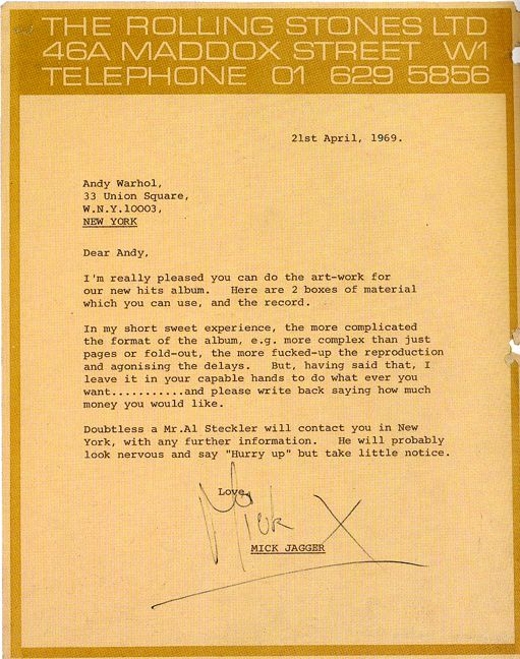
Trusting your designer

Matt Carey brought this letter from Mick Jagger to Andy Warhol to my attention – the kind we’d all like to receive!

The grey and grey book

Rob Waller spotted this article by Nicholson Baker (The Mezzanine, Double Fold) about the physical aspects of reading books and ebooks.

It’s not entirely negative, but here is his first impression of the Kindle’s typographic presence: ‘The problem was not that the screen was in black-and-white; if it had really been black-and-white, that would have been fine. The problem was that the screen was gray. And it wasn’t just gray; it was a greenish, sickly gray. A postmortem gray. The resizable typeface, Monotype Caecilia, appeared as a darker gray. Dark gray on paler greenish gray was the palette of the Amazon Kindle.’

Small subfusc cephalopod

Reading alumna Clair Georgelli’s site shows her books chronicling the adventures of a Little Black Squid: Polka Dot Design

Readers do notice

I was glad to read Philip Pullman’s review of Athanasius Kircher's Theatre of the World by Joscelyn Godwin in today’s Guardian draws attention to its design: ‘But the main thing to say about this book is that it is a stupendously good piece of design. Every illustration is reproduced in exactly the right place; the captions are superbly apt and very clearly signalled; the sidebars are tactfully positioned and filled with exactly the right amount of information. The paper is heavy and rich, and properly bound. The author and the publisher [Thames & Hudson] have taken real, prolonged, and exhaustive pains to make a beautiful book, and succeeded.’

Running with scissors (and saws, hammers, nails)

Anyone concerned with the safety of children in school might be alarmed by this page from a very large-format picture book intended to promote pre-reading conversation and discussion in 1950s primary schools.

Collection: Sue Walker

Legs & Co.

This hand-drawn lithographic poster, which doesn’t carry a printer’s imprint or date, shows that you don’t need Photoshop to extend legs to eye-catching length on a billboard – the lithographic artist could do it all!

Collection: Department of Typography & Graphic Communication

Isotype revisited

The website of the AHRC-funded project Isotype revisited is now up and running. You might like to listen to this episode of Melvyn Bragg’s In our time where Otto Neurath’s contribution to logical positivism is discussed.

They’ve got form

Inland Revenue formThe ‘Designing information for everyday life’ team write:

The official form – in the literal senses of ‘a set order of words’, ‘a formal procedure’, and ‘a document designed to elicit information’ – remains a void in design history. There exists no account of the development of this neglected genre of information artefact.

This month at ‘Writing design’, the Design History Society’s annual conference, Paul Stiff convened a panel on ‘Designing and reading forms of discourse’ at which he and his colleagues Paul Dobraszczyk and Mike Esbester gave a sequence of three talks on the official form, arising from their work on the AHRC-funded project, ‘Designing information for everyday life, 1815–1914’.

Why is this work of interest to design historians, information designers, and people working in applied language studies? Because forms instantiate the earliest type of what came in the late 20th century to be called interaction design. They give concrete shape and particularity to the abstractions of ‘discourse’. They offer the prospect of insight into modes of (anonymous) designing before designers. And they promise the possibility of richer conceptions than are currently usual of historic users of design, readers who were required to respond with acts of compliance but who misunderstood, committed errors, stubbornly made refusals, and routinely transgressed the boundaries of the question field inscribed by the official mind.

The black and white book (2)

Iain Stevenson doubts that the ‘iPod moment’ for ebooks will be with us in the near future, in a letter in today’s Guardian.

Making branding cute

Journalist may joke about the ‘i’ prefix being an Apple trademark, but it seems that Apple does see the funny side.

Evidence-based design

Maybe not much hope, if Garry Trudeau is to be believed.

The black and white book

Mark Batty, writing in Forbes on ebooks, and the Amazon Kindle in particular, stresses the monochrome, one-dimensional quality of the electronic product. Exactly the same things were lost when books moved from manuscript to print: for several hundred years almost all printed books were black and white, and incunabula certainly had a restricted range of type sizes and styles when compared to the richness of manuscript:

‘Disadvantages? It mostly contains words, not pictures, and not in color. The content available is somewhat limited so far to topics in popular demand – health, money, sports, hobbies, news analysis, baby names. Conventional text titles, such as fiction, biography and history, are gaining traction, however, especially in certain niches, such as romance fiction, which comes in strengths from flaccid to super-steamy – and the latter has the advantage of coming to you digitally, wirelessly and confidentially, although, alas, also unillustrated.

‘What you read on the Kindle is all gray – a few shades of relatively low-resolution gray. It's always set in Caecilia, not a bad font in its own right, but what you get on the screen is words, not design. Whether your reading matter is racy, mind-numbingly violent, ingeniously obtuse or an auto parts list, it all looks the same. A purpose of type is to help evoke appropriate feeling though a pleasing but unobtrusive design. The fact that the Kindle can’t do this today indicates that it is not yet a book at all.’

Art on the street

Earlier this summer, when the Fine Art department degree shows were about to take place, I was convinced that these cryptic marks were part of a mystical street art installation – ley lines for urban utilities. They turned out to be just surveyors’ spray-painting after all, as I discovered when the roads around Earley Gate were unceremoniously dug up.

Read a book? Now wash your hands …

I saw this in the loos at Reading University Library. At first I thought it was an attempt to prevent sticky student fingers handling the books (there is a new café in the Library), but then I realized it was just part of the general swine flu precautions …

Numerology

The post may (or, depending on any delay at Blogger’s servers, may not) be posted at 09.09 on 09.09.09. You might have preferred me to wait until 20.09 on 20.09.2009. Are you a number? Or are you a free man?

A quick guide to italic handwriting

Thanks to Peter Fraterdeus at ATypI for this link. As he says, nothing like a nice ductus before coffee.

Accuracy v. clarity


It’s interesting to consider the things that this railway map of 1912 has in common with Henry Beck’s Underground diagram. Of course there is the colour coding of lines, but this map retains the cartographer’s use of pastel colours bounded by black outlines rather than the graphic border-less lines of Beck.

At first sight, it appears to be geographical, and it’s easy to check this as most of the lines still exist. Laying an image of the map over a map from www.openstreetmap.org reveals that, in common with Beck, the complex central area is expanded, and the contextually important, but less complex outer extremities are compressed. The curvature of the lines that exit from the map is exaggerated, the orientation is amended to make the central area almost horizontal, and the Thames is reduced to contextualizing fragments where the lines cross it.


I’m not sure that the current Wikipedia visualization of these junctions is an improvement!

¶ If you’re unfamiliar with pre-metric British measurements, m = mile and c = chain (= 66 feet/22 yards). Because track distances were historically recorded in miles and chains, the unit is effectively still in use on Britain’s railways – take at look at the retaining wall on your left as you leave Paddington for the West.

¶ Rob Waller discusses some related ideas about stressing the important bits of a visual message here.

(1912 map and current visualization from Wikipedia; geographic map from openstreetmap.com)

No X please, it’s the Bible

To provide 3-line drop initials for the Oxford Lectern Bible (1935), Monotype cut a special semi-bold titling series, which is shown in the OUP ‘List of jobbing founts’ under the same Series number, 295, as the regular Centaur Titling.

Bruce Rogers describes the design process in his booklet ‘An account of the making of the Oxford Lectern Bible’: ‘The Centaur capitals were not heavy enough for the three-line chapter initials: so a new fount was cut. The first cutting proved to be too heavy, but the second cutting produced the initials shown here.’


You might expect this to be a full titling alphabet – but why the note ‘No “X” available’?


Another OUP specimen, ‘List of Monotype founts’ provides the answer. An Authorized Version of the Bible requires an initials of every letter of the alphabet – except X. The full table is shown below:


Being mean with letters you didn’t need was a bit of a Bible tradition at Oxford. The New Emerald Bible type, designed by Harry Carter, was only equipped with two small capitals, D and R. These were quite sufficient to set the only two words that appear in cap and small cap in the Authorized Version, ‘LORD’ and ‘GOD’. The lower-case o doubled as a small capital in this typeface.

‘An account of the making of the Oxford Lectern Bible’, Philadelphia: Lanston Monotype Machine Company [c. 1941]

‘List of | JOBBING | FOUNTS | Monotype and foundry | at the | UNIVERSITY PRESS | OXFORD | [swelled rule] | OXFORD | Printed by VIVIAN RIDLER | at the UNIVERSITY PRESS | October 1962’

‘LIST OF | MONOTYPE FOUNTS | AND SPECIAL SORTS | AT THE | UNIVERSITY PRESS | OXFORD | [university arms] | OCTOBER 1976’

Photograph of ‘An account …’ by Raph Levian

A day in …

The Oxford Almanack 1997About time we had some links to the work of Michele Tranquillini. The postcard shows a view in the Covered Market, Oxford, drawn for the Oxford Almanack. This link is to his two guide-books, A day in Rome and A day in Milan and this and this to two micro-tours of Milan.

New type faces

The first showing of designs by the current MA Typeface Design students is now at www.typefacedesign.org/2009

Design by Crystian Cruz

Back to basics in reproduction technology

A reminder that you don’t need to be online to print …

(Thanks to Dave Kellam)

Public service broadcasting

Some 50 years ago, in very different economic times, commercial television companies didn’t winge about the market or seek to reduce their commitment to serious programming, as this ad, placed in the Daily Mirror, shows.

Daily Mirror, Monday, 22 September 1958, p. 10

Decus et tutamen

Here is a nice example of decoration that is useful. When you ink and print from a small area of type for a specimen, it’s good to have some support for the rollers and the paper. This way you avoid over-inking at the edges of the type area. So in this 1637 specimen of Brevier Hebrew, bought by Samuel Brown from the estate of Arend Cornelisz. van Hoogenacker in Leyden for Oxford University, a border of printer’s flower is literally in a supporting role. (Brown was swindled – few of the founts were complete – and putting them in order was a major task.)

Barker, The Oxford University Press and the spread of learning (1978), p. 11

New blog links: London lettering and the Press

In the sidebar I’ve added links to Faded London, a typo-literary blog by Peter Robins (one of the Daily Telegraph’s Paper Tigers), and Alan Formby-Jackson’s newspaper design blog.

Test your sense of style

You can give yourself a test of good (journalistic) style here.

How hand compositors justified lines

This is the clearest explanation I have seen of the sequence of spacing adjustment, the visual basis for the adjustments, and the fine gradations possible in hand-set metal composition.

COMPOSITOR’S WORK IN PRINTING

As setting proceeds, the compositor will separate his words with a potentially variable space, i.e. one that may have to be increased or decreased when justifying the line. This space may be either a thick or a middle space. When the Style of the House demands close spacing, it is often wise to make the middle space the variable rather than the thick space which is commonly used as the standard and this is particularly applicable when faces of a narrow set width are used.

Having filled the measure with the maximum number of words and decided whether the next word has to be hyphenated or whether it will commence the succeeding line, the compositor first reads the contents of the line from the copy, corrects if necessary, and then proceeds to justify the words. In modem practice, it is generally considered preferable to decrease rather than increase spacing and to avoid any irregular word spacing, as is seen in the practice of placing an em quad or extra space after a full point at the end of a sentence.

The aim in justification must be to secure spacing that is visually equal and this requires that the actual space placed between words is often unequal. In decreasing space, alteration is first made between commas and letters that have round or inclined strokes like c, o, r, v, w and y, and of these, the last three (v, w and y) have the effect of imparting additional visual space to a greater extent than the others. Combinations of letters have to be watched; there is, for example, greater visual space between y followed by v than there is between y followed by k. Decreases in spacing are made lastly between successive ascenders and certain descenders; there is far less visual space between letters like d followed by l or by b than there is between combinations such as y and v.

These aspects of visual spacing make it evident that when increasing word spacing, the alteration is first made to the space between ascenders like d, h and I and the letters m and n, and that the last combinations to be increased are those of v, w, y and also the comma and full point.

In normal text composition, it is the aim of the compositor not to use a space larger than an en quad and to become seriously concerned should he reach two thick spaces. On the other hand, he is always faced with the possibility of a compromise in endeavouring to avoid successive lines commencing with the same word or ending with a hyphen. Yet a craftsman cannot escape the fact that extremely wide spacing results in very unpleasant ‘rivers’ of white space, that peculiar effect which arises from the spaces in successive lines falling under each other and thus spoiling the effect of a type page.

When decreasing spacing, the sequence followed will be to change the thick spaces to middle spaces, and then to thin spaces. Very occasionally, the range may be extended beyond this by employing hair spaces after a comma, full point or parenthesis but the technique must be employed with care.

In increasing spacing, a middle space may be altered to a thick and from this to two thin spaces. Next follows a thin and a middle space and then two middle spaces (or an en quad). In going beyond the en quad, many compositors overlook the fact that the next combination in increased thickness is a thick and a thin space which is very slightly thicker than an en quad but not so wide as a thick space with a middle space - the combination usually used. The next higher combinations are a middle and two thin spaces and then two thick spaces. Finally, there are combinations of a thin and two middle spaces and then a thick with two thin spaces.

Using the theoretical division of the em quad into 60 units, the following table shows the comparative thickness of space combinations used to increase word spacing:

20 thick [C]
24 two thins [E+E]
27 thin and middle [E+D]
30 en (two middles) [B=D+D]
32 thick and thin [C+E]
35 thick and middle [C+D]
39 middle and two thins [D+E+E]
40 two thicks [C+C]
42 en quad and thin [B+E]
44 thick and two thins [C+E+E]

From this table it will be seen that the differences between certain combinations are very subtle and enable very fine adjustments to be made. Some of these slight increases are extremely useful when the compositor has justified a line that is slightly ‘soft’ in the stick and needs only minute adjustment to make it tight.

It is part of the compositor’s technique to be thoroughly familiar with the range of space combinations so that the full scope of increases comes instinctively and it is not necessary for him to have to adopt a ‘trial and error’ method and so slow up his production. The learning of the correct scope of justification is achieved as part of the slow and deliberate setting practice by the beginner and provides yet another reason why any aspect of speed must be divorced from initial attempts to gain the correct technique.

It has often been stated that in the setting of poetry, the words are equally spaced and this is often taken to mean that the spaces employed must be of equal thickness. Yet the same rules of visual spacing apply to poetry as to any other composition and, in point of fact, as the lines are running free, the inequalities between letter combinations are given greater emphasis than they are in normal solid matter.

The Style of the House will specify whether space is to be placed before certain points of punctuation and the compositor will follow this (except where the space is on the body of the letter) yet he must also employ letter spacing where it is required - as in lines of capitals and put in the spaces as he sets and not wait for the letter spacing to be marked in the proof.

H. W. Larken. 2/e, 1964. London: Staples Printers Ltd., pp. 91–3.

The illustrations are by Tom Hughes, from Introduction to printing: the craft of letterpress by Herbert Simon. London: Faber, 1968.

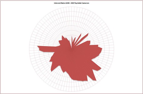
History is circular shock!

This graphic, based on Guardian data, seems to prove that James Joyce was right, and that time ‘brings us by a commodius vicus of recirculation back to Howth Castle and Environs.’

I also prefer to have my axes labelled …

A teaching style for our MA courses?

Sarod musician Ali Akbar Khan was taught by his father: ‘As vocal music forms the basis of all Indian classical music, Ali Akbar was made to spend hours practising the sargams, sol-fa passages, and taans, musical figures. He was never allowed out of the room until his father was satisfied that he had got them right. Percussion and talas, time measures, he learned from his uncle, Fakir Aftabuddin. As [Ravi] Shankar wrote: “Ali Akbar told me he had been compelled to practise for 14 to 16 hours every day, and there were times when Baba tied him to a tree for hours and refused to let him eat if his progress was not satisfactory.” ’

Display faces

Some wonderful urban photography here.

Mountain out of a molehill

This extraordinary boxed set of 20 volumes has been hewn out of Kenneth Grahame’s The Wind in the Willows by Egmont Publishing. (The box even has a drawer underneath the bookshelf – presumably for keeping your coldtonguecoldhamcoldbeefpickledgherkinsaladfrenchrollcresssandwidgespottedmeatgingerbeerlemonadesodawater –)

Size matters

Alexander Chancellor’s piece in yeasterday’s Guardian is worth quoting:

‘I still have a copy of the New York Times from 12 September 2001, the day after the twin towers collapsed in the worst terror attack in American history. The event merited what may also have been the biggest headline in the history of the New York Times – the words US ATTACKED in one-inch-high capitals across the top of the front page. The paper has never screamed so loudly since. But this month, day after day, the Daily Telegraph has been carrying headlines just as big over developments that, whatever their importance, cannot remotely be compared to the events of 9/11.

‘Even yesterday, on the 14th day of its drip-drip exposure of MPs’ expenses, Bill Wiggin’s “phantom mortgage” and Sir Peter Viggers’s floating duck island were given headlines in the same type-size as that used by the New York Times on that momentous day. One wonders how the Telegraph, having already blown its loudest bugle, would respond to a truly shattering piece of news, such as the outbreak of the third world war.

‘The Telegraph is rightly proud of its scoops, but with its overblown presentation it has weakened rather than amplified their impact. If you excessively hype news that doesn’t need hyping, the news starts to seem less important than it actually is. Apart from which, as London’s only remaining broadsheet newspaper, with an old-fashioned gothic masthead like the New York Times, the Telegraph creates expectations of calm and restraint that, as the NYT does, it ought to try to meet.’

Where’s the script, Eurovision?

I may have missed something – distracted by Miss Azerbaijan, perhaps? – but I came away from Saturday’s songfest feeling that the Cyrillic alphabet had been well and truly hidden. The inter-act sequences featured three-dimensional letters flying through Moscow, but all that I can remember is that they looked like Helvetica, not which script they were. And the far more prominent ‘postcards’ shown between each song featured Russian words, but only in a Roman transliteration. And in English transliteration and translation, too.

Transliterating Russian can cause problems between western European languages, as shown by the problem of Чайкóвский = Tchaikovsky = Tschaikowsky = Chaikovski (apparently this is the Library of Congress’s preferred form). Did the Russian tv producers think that integration with Eurovision meant keeping the non-Western national alphabet under wraps? But again, maybe it was just another aspect of the domination of World English – only the most determinedly Francophone countries stuck to French when casting their votes.

Collocation, collocation, collocation

Do you think it is likely that Stuart Proffitt, the publishing director of Penguin Press, actually said ‘People in the book business are always saying there’s a crisis and we’re going to hell in a handbasket’? Handbasket? We usually descend to the infernal region in a handcart, which has the advantage of wheels to facilitate the onward motion. A handbasket would require a slippery slope of a considerably steeper angle to initiate the slide towards doom.

Or was Mr Proffitt correctly transcribed by the Guardian? Perhaps a distant memory of Margaret Thatcher’s demonic handbag was in his mind at the time. Perhaps he believes we have a dog-in-hell’s chance, or that hell might melt over?

Pooh and typography

1. Consistency, redundancy, reading order, and calls to action

Owl lived at The Chestnuts, an old-world residence of great charm, which was grander than anybody else’s, or seemed so to Bear, because it had both a knocker and a bell-pull. Underneath the knocker there was a notice which said:

PLES RING IF AN RNSER IS REQIRD.

Underneath the bell-pull there was a notice which said:

PLEZ CNOKE IF AN RNSR IS NOT REQID.

These notices had been written by Christopher Robin, who was the only one in the forest who could spell; for Owl, wise though he was in many ways, able to read and write and spell his own name WOL, yet somehow went all to pieces over delicate words like MEASLES and BUTTEREDTOAST.

Winnie-the-Pooh read the two notices very carefully, first from left to right, and afterwards, in case he had missed some of it, from right to left. Then, to make quite sure, he knocked and pulled the knocker, and he pulled and knocked the bell-rope, and he called out in a very loud voice, “Owl! I require an answer! It’s Bear speaking.” And the door opened, and Owl looked out.

from A. A. Milne, Winnie-the-Pooh (1926). Drawing by E. H. Shepard

Design at the Oxford Literary Festival

Some suggestions for events at the Oxford Literary Festival, Christ Church, Oxford 29 March–5 April

Thursday 2 April

Stuart Sillars | The Illustrated Shakespeare, 1709–1875 | 10am Blue Boar Marquee, Christ Church £7.50

Building on his earlier book Painting Shakespeare, Stuart Sillars’s The Illustrated Shakespeare, 1709–1875 takes a fresh look at the tradition of visual criticism and assimilation of Shakespeare’s plays. In his talk based on his highly illustrated book, he helps us to see what Shakespeare’s readers saw when they opened their editions across two centuries and found images as well as dialogue.

Kenneth Powell | Powell and Moya | 2pm Blue Boar Marquee, Christ Church £7.50

Powell and Moya were one of Britain’s most significant postwar architectural practices, and in this comprehensive and engaging book, their history has been chronicled for the first time the eminent architectural author and critic Kenneth Powell. Founded in 1946, the practice rapidly established a reputation for an approach best described as ‘humane modernism’. Structured by building type, this book reveals the principles of design particular to Powell and Moya and tells how they were at the forefront of hospital design and succeeded in bringing modernism to Oxford and Cambridge.

Friday 3 April

Richard Ovenden | The Future of the Past: The Bodleian’s Great Acquisitions | 4pm Bodleian Library, Divinity Schools, Catte Street £7.50

Richard Ovenden was educated at Durham University and University College, London and has worked as a professional librarian since 1985. He has served on the staff of the House of Lords Library, the National Library of Scotland, at the University of Edinburgh, and now at the Bodleian Library (as Keeper of Special Collections and Associated Director of Oxford University Library Services). Richard has published widely on the history of collecting, the history of photography and on professional concerns of the library, archive, and information world. He holds a Professional Fellowship at St Hugh’s College, Oxford. Richard will talk on the Bodleian’s great acquisitions. The library has recently benefited from Alan Bennett’s gift of his literary archive, and has been able to save for the nation the earliest surviving score of an opera in the English language, Cavalli’s Erismena.

The Book is Dead: Long Live the Book | Chris Meade, Kate Pullinger, and Bryan Appleyard | 6pm McKenna Room, Christ Church £7.00

Is literature as we know it really moving from printed page to networked screen – or is this just hype? Our panel will examine the impact of the internet (the ‘read/write web’), and other new media on the book. It will debate whether fiction is becoming interactive, collaborative and non-linear, and how new technologies such as e-readers and print-on-demand machines are changing the way we read, write and consume literature. Panellists include Sunday Times critic Brian Appleyard, Chris Meade, former director of the Book Trust, now director of If:Book, a ‘think and do tank’ exploring the impact of new media on reading and writing, and writer Kate Pullinger, whose novels include A Little Stranger and www.inanimatealice.com, a multimedia graphic novel in episodes. Chaired by Lucy Atkins.

Sunday 5 April

David Gentleman, Brian Webb, and Peyton Skipwith | Design | 2pm Festival Room 1, Christ Church £7.50

The renowned Design series grew out of an exhibition and its catalogue at the Fry Art Gallery, Saffron Waldon, celebrating the centenaries of Edward Bawden and Eric Ravilious. Peyton Skipwith’s and Brian Webb’s latest book on Curwen Press covers the work of the groundbreaking printing house, which listed many of the early 20th century’s best-known designers, artists and illustrators among its contributors. David Gentleman has designed British postage stamps and a platform-length mural on the London Underground. There have been many exhibitions of his landscape watercolours and architectural lithographs; his posters have been carried on marches protesting against the wars in Iraq and Gaza. Here he, Brian Webb and Peyton Skipworth talk about the design of the past and present and its impact on our lives.

David Gentleman | 6pm Junior Common Room 7.50

David Gentleman has travelled widely and has written and illustrated books on Britain, London, Paris, India, Italy and Anglo-American relations. He has designed British postage stamps and a platform-length mural on the London Underground. There have been many exhibitions of his landscape watercolours and architectural lithographs; his posters have been carried on marches protesting against the wars in Iraq and Gaza. He will talk about designing for benign and toxic purposes, the pleasures and stresses of drawing as a job in which his only regular commuting has been upstairs to his studio, and the inseparability of art and design.

Atlantis found – Plato comments

However barmy the story, and however corny the illustrations, at least the Sun should get credit for supporting its speculation with graphic material. British on-line newspapers are far behind sites such as the New York Times in this respect.

The provisional book

Thanks to Joseph Sullivan for pointing out this article by Nicholas Carr via Twitter:

‘ “Your library has been successfully updated. The next update is scheduled for 09:00 tomorrow. Click this message to continue reading.”

One of the things that happens when books and other writings start to be distributed digitally through web-connected devices like the Kindle (right) is that their text becomes provisional. Automatic updates can be sent through the network to edit the words stored in your machine – similar to the way that, say, software on your PC can be updated automatically today.’

[read more]

Parole in libertà

The Guardian reports the British Library’s purchase of Marinetti’s Parole in Libertá Futuriste Olfattive Tattili Termiche, printed on tin, here.

Design for people who won’t pay

Talking to an architect the other day about careers in the design profession, he reminded me of the great disadvantage that graphic and information designers have compared to architects: there is no professional standard by which clients can judge the services they are offered. Anyone can set up as a typographer or web designer. Architects have to pass exams and belong to a professional body, regulating their practice. I hope that this is one aspect of the ‘professionalization’ of design in the post-war period that Paul Stiff will address in his forthcoming writing on the ‘Optimism of Modernity’. But for now, thanks to John Boardley of ATypI, we can see exactly what you get if you think you only need pay peanuts for design.

Discussing interface design

Damon Clark visited the Department of Typography & Graphic Communication today, to talk to MAs about designing interfaces for mobile devices and tvs. In particular, he drew a distinction between the relatively free placement of ‘hot’ areas on computers and touch-screen devices, and the way that phone and tv screen interfaces are limited to up–down, left–right selection. This is enforced by direction buttons on phones and on tv remote controllers, resulting in a cruciform arrangement of options on screen. (Subsequently, it was interesting to see one MA experimenting with this format in her book design project: using a left–right axis to show a sequence of activities, with a vertical axis to offer alternative actions at certain points.) Damon’s work is currently for Orange, but he is also responsible for the Espy screen font used on the Apple Newton and iPod Mini.

Per Mollerup visits Reading

The Danish designer Per Mollerup made a welcome visit to Reading today to talk to MA students. He reminded them that wayshowing is what we need to do to support wayfinding. And he also demonstrated that pictograms confuse as well as enlighten in many cases. (For example, is male and female, or is it the other way around?)

Here is an example of his work at Copenhagen airport, replacing illegible white-on-yellow signs with clearer white and yellow type on a dark blue background.

Futura v Gill Sans

To celebrate the return of Mad Men, and also to acknowledge Revolutionary Road, this blog has been transformed* to point out the typeface blunder that both the tv show and the movie make: to think that Gill Sans would be used for signage in 1955 (RR) or 1962 (MM). Gill Sans was simply not on the radar in the US then – surely they mean Futura? And as for the Helvetica in the realtor’s sign in RR – arrrgh!


* At least, for users of Mac OS X. It’s Twentieth Century if you're using WIndows.

More than one process …

This little guide book, published in Moscow in 1957, shows how the contents of such books were constrained by the printing processes available. The first 176 pages are printed letterpress and contain only text and line drawings; photographs are confined to a 48-page gravure section at the back of the book.

A. Ковалиев (Trans. V. Shneerson). По Москве: краткий путебодитeль. Moscow: Foreign Languages Publishing House, 1957

Cold-weather cover

I thought this book-cover from 1898 would be appropriate given the current temperatures.


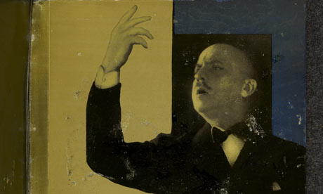
Fridtjof Nansen, “Farthest North”, being a record of a voyage of the ship Fram 1893–96 and of a fifteen months’ sleigh journey by Dr. Nansen and Lieut. Johansen with an Appendix by Otto Sverdrup Captain of the Fram. London: George Newnes Ltd. 1898

How typography happens

The following is adapted from a review that first appeared in the Printing Historical Society Bulletin

‘Making books made easy’ was the headline in an issue of Design Tutor, a how-to-do-it-yourself guide that promoted the make-over and the quick-fix design solution – much in the manner of today’s gardening programmes on tv. In such an approach, a discussion of small capitals naturally found its place in ‘Nitpickers’ Corner’, while ‘Our Heroes’ featured a designer who, the magazine claims proudly, ‘wasn’t a designer at all’. Perhaps one drawback of the title, How typography happens, chosen for the casting into print of Ruari McLean’s measured and elegant Sandars Lectures is that it will be taken as part of the ‘how to do it’ genre. The explanatory line, which appears on the back of the jacket but nowhere in the book itself, ‘an account of how typography became a profession in its own right, and changed the face of book and type design’, is closer to a description of the contents, but perhaps not close enough.

For a book which claims to describe the emergence of a profession, this is still a firmly top-down history, not a social one. Few designers are discussed in any detail – and all of them are master practicioners (there are no women). The scene is restricted by something akin to the dramatic unities: Britain, America, France, and Germany; concentrating on the period 1830–1930; mainly book and type design. Perhaps the demands of the public lecture require an adherence to narrative and to the promotion of strong rulers and law-givers – as Simon Schama’s 1990s television history of Britain showed. The historian whose writing is rich in social context went for the 1066-and-all-that approach when confronted with the screen’s demands for visuals and a strong story line. The trick is to do it well, as both Schama and McLean proved by pulling it off.

But typography doesn’t just happen. It is made. McLean is careful to explain that, despite the early printing manuals’ focus on the tasks and duties of the compositor, the executors of typesetting are not those who make typography happen. He points to the need for a guiding intelligence, initially provided by the master printer. For McLean, the starting point of the typographic profession, and the point at which the word typography began to shift its meaning from printing to design, is the transfer of this guiding intelligence to the publisher, to the person who commissions print rather than carries it out. Naturally this shift is a result of economic and social as well as technical developments, and McLean places it firmly in England in the 1830s, when the publisher William Pickering can be identified as responsible for the design of books printed for him by Charles Whittingham.

McLean’s ideal typographer needs to be more than a competent professional. Changes in typography can only happen, he argues, if practitioners take part in education as well as design. And that involvement in education needs to be practical. The publication of manuals and histories (De Vinne’s aimed at printers, Updike’s aimed at ‘intelligent people interested in printing’) allows experience to spread. Different national cultures influenced this process in different ways. He points out the difference in status between the British and German printing trades at the turn of the century, and traces the transfer of the typographic torch from the unadventurous British to the technically educated, status-conscious Germans, with their printing schools in Berlin, Munich, and Leipzig. McLean clearly admires the thoroughness he sees in the German approach, naturally focusing on what he describes as ‘Tschichold’s “New Typography” ’. Jan Tschichold is his ideal practitioner and educator: he writes economically for compositors and printers, not dilettantes, and his writing is practical, sensible, and ‘truly efficient’. McLean contrasts his 24-page, A4 booklet on how to draw layouts with Thibaudeau’s ‘expensive and elaborate’ Manuel Français de Typographie ‘that few compositors could have afforded or would even have seen’. McLean emphasizes Tschichold’s youth, and the speed of his typographic development: 21 when he first saw modern art, 23 when his essay ‘elementare typographie’ was first published by the national trade magazine Typographische Mitteilungen.

McLean retells the bemused reaction to the New Typography in the Anglo-Saxon world, reserving praise only for Edward McKnight Kauffer and the printers Lund Humphries for promoting Tschichold in London before the second world war, and Paul Rand for understanding it in the States after the war. The ‘moderne’ American approach to typographic design is illustrated (and decried) by showing Frederic Ehrlich’s ‘faulty’ manual The New Typography & Modern Layouts, its hectic page tellingly placed opposite a calm Birkhäuser title-page by Tschichold. McLean is more ambivalent about the new traditionalist club of British typographers, but implicitly criticizes Francis Meynell, Morison and Oliver Simon for their ‘numerous trial proofs of title-pages’. If only they had drawn their layouts more carefully!

While McLean is able to knit together a typographic narrative that that binds events and practitioners in Britain, Germany, and America, he admits that France must be treated as a separate case: in France ‘we find something completely different’. McLean provides a convincing explanation for la différence, pointing out the stronger tradition of the book-illustrator and artist (Daumier, Delacroix, Doré) in nineteenth-century France, and the lack of influence that the closed, subscription-only private presses had on the trade in general. McLean’s illustrations for this chapter include four pages from Tolmer’s Mise en page and five from Thibaudeau’s Manuel. But as the latter is set in the Auriol typeface, and George Auriol’s designs are shown in a further three illustrations, the reader is overwhelmed by his particular style. In contrast Maximilien Vox, whose wide-ranging talents are described, is illustrated by a portrait, some quotations, but not by examples of his work. Vox’s typographic guidelines for corporate clients such as the French Ministry of Finance or the French broadcasting organization after 1945, which would seem to indicate the final arrival of the typographic designer as a professional, are not mentioned at all. The chapter on the French convinces the reader that they were certainly different, but does not show that theirs was a genuine contribution to modern typography.

The book ends with Vox’s comment ‘I can only work joyfully’. This book has the advantages of a strong narrative thread and an engaging style. Quotations in French and German appear in the original language as well as in translation. The text is neatly set in Fred Smeijers’s Renard typeface, but some of the illustrations in the chapter on France are not quite as sharp as they could be; none show the items illustrated as three-dimensional objects, and not all have exact reduction values. The illustrations, which come in groups of up to 8 pages, occasionally interrupt the flow of the text for the reader.

Ruari McLean
How typography happens
London: The British Library/New Castle, Delaware: Oak Knoll Press, 2000
0-7123-4634-1 (BL cased edn.)
234 x 156 mm, 96 pp., 69 b/w illustrations