
The pleasures of pastiche

 ‘The pastiche project’ will be familiar to Reading Typography graduates of a certain age. The task was to design, and then typeset and print, a small document which reflected a particular historical style – the work of a great printer, or a piece of familiar ephemera from the Department’s collection. The project, of course, made you think quite hard about exactly what part of the presentation of an object embodied its visual essence, and to consider whether the resources available now (in those days metal types, of course) were sufficiently similar to the historical model to pass muster.
My note on the typography of Mad Men shows how difficult it is to reproduce the familiar items of the recent past accurately. So, for your edification, two pastiches produced as Christmas ephemeral items: wine lists based on designs by Jan Tschichold and Horace Hart. The Tschichold uses City and Bauer Bodoni, both reasonably accurate digital redrawings of metal designs. The Hart pastiche (based on a table in Notes on a century of typography at the University Press, Oxford, 1693–1794) uses the careful digitizations of Fell made by Igino Marini. If you think they could be improved, be sure to let me know.
Last chance to see …
 … Vivian Ridler’s Christmas cards (actually cards sent to him) at the Bodleian Library until Christmas. Talking about cards, you can download this year’s Luna’s Café card from here.
Some links to follow
David Pearson’s own website is here. You can also see his new classic cover designs for White’s Books here.
This is James Morrison’s blog criticizing cover designs. And here is Steven Heller’s at Print magazine.
There’s a piece about Faber’s covers for their on-demand publishing in the current issue of Print.
This is James Morrison’s blog criticizing cover designs. And here is Steven Heller’s at Print magazine.
There’s a piece about Faber’s covers for their on-demand publishing in the current issue of Print.
The books they tried to ban
 Test your knowledge of censors and would-be censors in this quiz from the Guardian.
The cover illustration is from the first printing of Candide in the Penguin Classics series (1947). This was volume 4 in the series. The text may be a very early design by Jan Tschichold, who took up his role at Penguin in March 1947, but the setting, in Monotype Bembo 270, does not follow his famous composition style – dashes are unspaced em-rules, there are extra spaces after sentence full stops, and the long-tailed R is used.
The cover is the original pre-Tschichold design by John Overton; the roundel is by William Grimmond.
Edit
I’ve now managed to look closely at the first few Penguin Classics, and the Overton/Tschichold question is rather more complex than implied by the above, or by the simple statement in Baines, ‘only the first seven titles appeared in this design, before it was re-styled by Jan Tschichold in 1947–8’. Not surprisingly, the transition from one design to another in a series in production was not clear-cut. There are early PCs with Overton covers/Overton text; Overton covers/Tschchold texts and vice versa. Some books feature pre-war bowing Penguins, some a Penguin standing on an open book (Baines, p. 251); at least one with a Tschichold Penguin on the half-title, but no device on the title-page. Another has an Overton ‘jacket’ wrapped around what looks like a Tschichold cover.
Baines, P. (2005) Penguin by design. London: Allen Lane (pp. 46, 64–7)
The Face of Britain
 This was a series of travel guides to regions and buildings in the British Isles, published by B. T. Batsford Ltd in the 1930s. The cover I’ve illustrated is from the first printing of The Heart of Scotland, published in 1934. The vibrant colours of the jacket are achieved by the Jean Berté process, which used rubber plates and water-based inks (later printings were done by more conventional processes). Nan Ridehalgh, who often visits the Department of Typography & Graphic Communication at the University of Reading, has studied the process, and I hope to show more examples from her researches.
The illustrator, named as Brian Cook on the jacket, was actually Brian Caldwell Cook Batsford. A collection of his work appeared in The Britain of Brian Cook in 1988.
Book ephemera
 Thanks to Typegirl for this link to a site specializing in the labels that booksellers used to use to promote themselves. The picture shows a label from Foyles of London, pasted into the front board of my copy of The Wind in the Willows; the date must be around 1961.
Chance finds of fifties children’s books
 Researching my family history, I came across a cartoon in the Syracuse [NY] Post-Standard that seemed more stylish and whimsical than the run of syndicated strips: ‘Geraldine’. This turns out to be by the illustrator Elisabeth Brozowska, and here, thanks to Google and Flickr, is an example of her work.
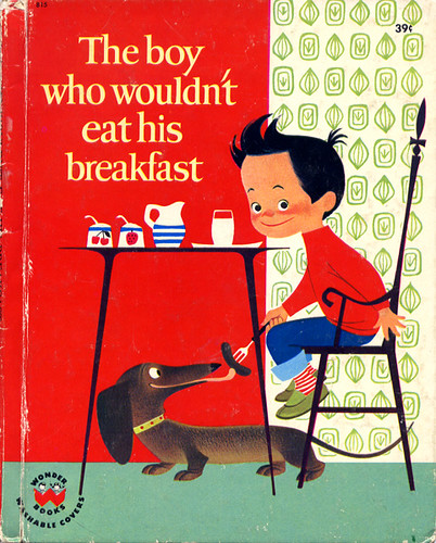
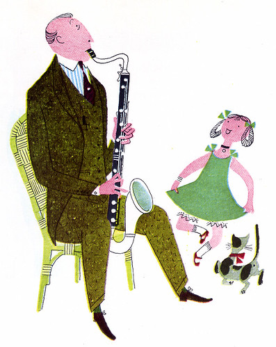
This led me on to other Flickr sets with post-war illustrations, and I found first these orchestral illustrations by Jan Balet (1951)
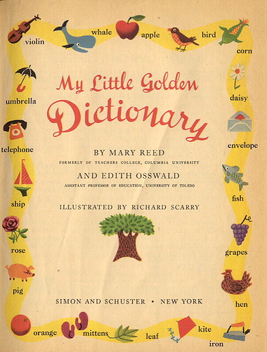
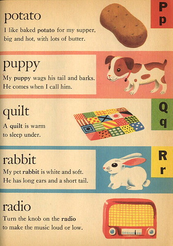
and this dictionary by Richard Scarry dated 1949.
Shall we join Canada?
 The New York Times satirizes its own election graphics here with an infographic that owes more to a wallpaper sample book than Isotype. (My favorites are Alaska and Washington.)
The Mad Men type spotter’s file
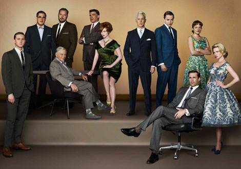 If, like me, you are waiting anxiously for the next series of Mad Men (those frocks! those opening credits!) but want to check those niggling feelings you have about the anachronistic use of type in the series, then here is the website for you.
Helvetica in a NYC glass house
 This interesting-looking structure, with a system of underground heating and cooling, also sports some large scale Helvetica. The explanatory graphic in the New York Times is worth looking at, too. (The structural engineers are a British firm.)
Why lower-case letters may have saved civilization
 Pierre MacKay, of the University of Washington in Seattle, writes of the revolution in handwriting that occurred in the 800s in this week’s Times Literary Supplement:
‘Not only Latin and Greek, but Arabic as well underwent a profound transformation from majuscule and Coptic hands to minuscule or, as it is tellingly named in Arabic, naskhi (= copyists’) hands, which are less ornamental, but faster to produce, and usually take up less space.
‘The illustration that accompanies the review [in the 26 September 2008 issue of the TLS], of a fourth-century bible, shows majuscule Greek at its best, but a great deal of surviving majuscule is not open and rounded like this example but compressed horizontally to a point of seriously decreased legibility. A well-known inability of later readers to distinguish EIC from EK is one result of this compression. …
‘The two centuries preceding the ninth were not good times for books. War, natural disasters and decay continued their inroads on the majuscule heritage, but copyists were less and less active. The first chapter of Paul Lemerle’s Le Premier Humanisme byzantin paints a gloomy picture of literacy in that time, and things were no better in the Latin West and not much better in the Islamic Caliphate.
‘The invention of the three minuscules (including naskhi) should not be seen as causing the loss of the heritage from late antiquity, but rather as a response across three cultures to the realization that unless the copyists got to work fast, there might be nothing left to copy.’
The illustration,of a Carolingian minuscule from the Grandval Bible, Tours, c 840, is from Nicolete Gray, A history of lettering, p. 68
Talwin Morris and Reading
 An exhibition of binding designs by Talwin Morris (1865–1911), associated with Charles Rennie Mackintosh and the Glasgow Style, is now on in Reading University Library Special Collections. Morris’s particular connection with Reading is the period he spend as a young man in the Reading architectural office of his uncle, Joseph Morris. It was after this that he moved to Glasgow to work for the publisher Blackie & Co. in 1893, producing designs influenced by Japanese interior design, Art Nouveau, and the Arts & Crafts movement.
Two Bodleian exhibitions
The Original Frankenstein, 7 October 2008, Bodleian Library Proscholium
A special one-day display of Frankenstein manuscripts and related material.
A special one-day display of Frankenstein manuscripts and related material.
Vivian Ridler’s Christmas card collection, 28 November to 24 December 2008
This year Vivian Ridler, distinguished Printer to the University Press, Oxford from 1958 to 1978, celebrates his 95th birthday. This exhibition displays a fascinating selection of Christmas cards sent by printers and artists to Vivian and his late wife, the poet Anne Ridler, over a period of 60 years.
This year Vivian Ridler, distinguished Printer to the University Press, Oxford from 1958 to 1978, celebrates his 95th birthday. This exhibition displays a fascinating selection of Christmas cards sent by printers and artists to Vivian and his late wife, the poet Anne Ridler, over a period of 60 years.
Wall of letters

The contractors were helping Martin Andrews restore our lettering artefacts wall today. Previously in Spur H, it has now expanded along both sides of the corridor between Spurs E and F at the Department of Typography & Graphic Communication. The photograph above, taken in 2003, shows former Chancellor Lord Carrington, Martin Andrews, and Sue Walker admiring the signs.
The Retro Candidate?
What photocomposition meant for type

Here are some images from my presentation ‘Absolutely no type’ at this year’s ATypI conference.
Books produced by early phototypesetting systems publicized the fact that they were produced with ‘absolutely no type’. What letterforms were chosen for these new systems? How did they relate to existing type designs? What opportunities were taken (or missed) in the creation of new founts? How did the new typefaces for new machines affect the designers and typesetters who used them? By looking at the earliest phototypeset books, manufacturers’ and printers’ type specimens, and printers’ archives 1950-1970 we can find out more about the time when the certainties of metal typography began to dissolve into the new world of film.
All phototypesetting devices broke the link that existed in metal type between character width and escapement, that is the horizontal space in which a character sits. The latter could now be varied independently of character width, allowing any amount of under- or over-spacing of letters. This point is seized upon in this specimen for the Bawtree machine of the 1920s.

The Intertype Fotosetter promoted the new freedom of type design. Its hot-metal faces were constrained in two ways: characters could not kern (that is the top stroke of f could not hang over the following character), and character widths for roman and italic had to be equal, to allow for duplex matrices (which carried both fonts). Garamond seems to have been the first typeface adapted for the new machine, and the revised designs show how both constraints have been thrown aside.

Economy and efficiency were always te selling points for the new machines. The weight of the pieces of film used for a job was compared with the weight of the lead type that would previously have been necessary:

Letter-painting therapy
We’ve made a start painting the new spur-identification letters in the Department of Typography & Graphic Communication. Here are Martin Andrews and I with our work.


Two links to Sutnar
 Grain Edit has these two links to Ladislav Sutnar’s work – a brochure for Bell Telephone which is claimed as the origin for the parentheses around US area codes, and one of his Sweet’s catalogues. University of Reading special collections has a number of interesting Sutnar items, purchased with the help of Typography & Graphic Communication.
Blogging book covers
I’ve added a link to Joseph Sullivan’s blog about cover design, and it’s also worth noting Cover Design Issues. While these deal mainly with US trade publishing with a bias towards fiction, there are interesting comments on the development of a design, and also you can compare a designer’s intentions with the finished product. They are good at comparing US and UK approaches to the same titles, too.
And if you like design from the 50s onwards, here’s a relaxing place to go.
And if you like design from the 50s onwards, here’s a relaxing place to go.
Comics can explain
 I was impressed by Google’s explanation of their new Chrome browser in comic-book form. It actually made me want to read this geek stuff, and I think I learnt something about how browser technology works. My only puzzle is why the format is portrait when a landscape format would have fitted most screens better, and eliminated unnecessary scrolling within pages.
(Chrome itself seemed to mess up my XP installation, though.)
Edit
Sorry, Google, Chrome did not mess up XP. A Microsoft Update had stalled, but installing Apple iTunes for XP solved the problem (!).
Das Moderne Plakat

 A copy of this important example of 19th-century lithographic printing is now part of the University of Reading’s special collections. Fiona Barnard writes:
Das Moderne Plakat (The Modern Poster) by Jean Louis Sponsel was printed in Dresden by Verlag von Gerhard Kuhtmann in 1897. It is a bound volume, illustrated with fifty-two lithographic plates of posters, including examples of work by noted artists including Henri de Toulouse-Lautrec, Théophile Steinlen and Alphonse Mucha.
Posters, in the form of posted bills and placards for advertisements and announcements, have a long history. However, the invention of lithography in 1796 allowed for cheap mass production and printing, and the invention of chromolithography which followed made it possible to print mass editions of posters in vibrant colours.
By the 1890s, the technique had spread throughout Europe, and poster art was becoming increasingly popular and commercially successful. Posters soon transformed the thoroughfares of Paris into the ‘art galleries of the street.’
By the end of the 19th century, during an era known as the Belle Époque, the standing of the poster as a serious artform was raised even further, with the publication of the ‘Maîtres de l’Affiche’ (Masters of the Poster) series and Das Moderne Plakat, both of which not only enjoyed commercial success among art collectors, but are now seen as important historical publications, as many of the posters cannot be found today in any other format.
Can you get a cigarette paper between them?

If elections were won on kerning, letterspacing, and correctly positioned apostrophes, then these two wouldn't stand a chance.
Edit
An antidote.
New types for old
 This beautiful cover image is from a booklet describing the Rotofoto process, a photomechanical composition system developed in the late 1930s by George Westover, who had worked for Monotype.* Rotofoto, Uhertype (a Hungarian–German system), and the American Intertype Fotosetter are interesting because they show hot-metal type designs being adapted for photocomposition, and setting a high standard right at the start of commercially viable photocomposition.
The Uhertype, whose types are comprehensively discussed by Christopher Burke in his book Active literature: Jan Tschichold and the New Typography, had a comprehensive programme of type design, including versions of Monotype’s Gill Sans and Deberny & Peignot’s ‘French Roman’. The Fotosetter’s first typeface seems to have been Garamond, chosen no doubt because it showed off the phototypesetter’s ability to handle kerning.
The Rotofoto, reflecting its roots within the Monotype Corporation, offered Times New Roman and Monotype Old Style series 2. It’s not clear whether these were redrawn to any degree, or simply photographed from pulls of Monotype-set metal type. The Monotype connection was necessary: the keyboard for the Rotofoto was a Monotype one, and the unit widths of Rotofoto designs would have had to match those of the parent Monotype font.
I’ll be talking more about these and other early phototypesetting machines and the types they used at the ATypI conference in St Petersburg in September.
* See Boag, Andrew, ‘Monotype and phototypesetting’, Journal of the Printing historical Society, new series, 2, p. 58
Laurence Urdang
 The lexicographer who was a pioneer of computerized dictionary typesetting, Laurence Urdang, died recently. Here is his obituary from the New York Times. (You’ll need to register.)
The following is from my article in Typography Papers 4:
The production of the Random House Dictionary in 1964 was a landmark in the computerization of dictionaries. The managing editor, Laurence Urdang, was the moving force in the early computerization of dictionaries, and immediately envisioned a complete process in which text was entered, stored, sorted and compared, and finally transferred to a typesetting machine. The Random House Dictionary text was keyboarded after writing and each entry was divided and entered in fields assigned to different levels of information (for example headword, pronunciation, definitions, etc.). This made it possible to prepare information for each level and in each of 150 subject fields, ‘ensuring better uniformity of treatment and far greater consistency among related pieces of information than had been achieved on other dictionaries.’ (Urdang, 1984).
Though Urdang was successful in sorting and establishing the continuity of information throughout the dictionary, he was not able to set up a usable interface between the database and phototypesetting equipment of the time. Two machines, the Photon and the Videocomp (the US version of the Hell Digiset), were technically capable of being driven by magnetic tape, but the expected slow speed of composition caused by the frequent font changes in dictionary text, and the Videocomp’s inability to produce a true italic, ruled them out. Eventually print-outs from the database were used as copy for hot-metal Monotype composition.
For more information, see: Urdang, Laurence (1984). ‘A lexicographer’s adventures in computing’, in Dictionaries: journal of the Dictionary Society of North America, no. 6 (1984), pp. 150–65
Schleger’s stops
 The recent BBC series The Thirties in Colour showed footage of London before the bombing of the 1940s destroyed the continuity of building that had previously existed.
 One shot showed a street more or less unchanged in its architectural and street furniture essentials from Edwardian times – the exception being Hans Schleger's request bus stop, designed 1935–7. In the shot in question, the extraordinary modernist simplicity of this sign, and its startling use of colour, shone out in contrast to the rather fusty surroundings.
(Some idea of the effect can be seen in the photograph on page 97 of Pat Schleger’s book about her husband's work; again, the only ‘modern’ thing in the photograph is the typography.)
‘Then, with an anguished cry, Caesar (see page 5, col. 3)’
 If you’ve ever been annoyed by an article on a news website whose column is interrupted by an advertisement or puff for another article—made worse if the ad is slow to load—then your frustration is not new, as this article from 1923 shows:
‘[Newspapers] put all their heads on the front page—but as for their tails— The newspaper game of hunt-the-slipper demands much skill, and more patience, on the part of anyone who attempts to join it—at least, so I am told by the few “strong perseverin’” persons who pretend (although I hardly believe them that they have tried it).’
The writer discusses serious news stories interrupted by puffs for more popular features and badly judged turns to the continuation of a story (see my headline). Then, with a surprising example, he goes on to discuss the interruptions to the book reader from the arbitrary juxtapositions caused by printing text and illustrations on separate pages or in separate sections:
‘To my great discontent, I find the hunt-the-slipper dodge adopted, for no apparent reason, in Some Account of the Oxford University Press, 1468–1921. Thus: ‘The privilege of printing the Bible was not exercised at this date [1632]; but in 1636 Oxford University Arms’ (two p ages of them, dropped in on “anywhere-will-do” principles). Personally, I don’t see why the letterpress should ever be interrupted and the interest of the illustrations scattered in this irrational fashion. I like far better the orderly and systematic fashion of putting all the illustrations together at the end of the book, so that they shall not corrupt and obscure the text they are supposed to elucidate. This decorous arrangement is often observed in good books.
‘Reading on, I come to more “hunt-the-slipper” make-up. Thus: “The total quantity of type in the Press is estimated at FELL 3-line Pica John Fell, 1689, Christ Church.” Slightly incoherent, because four pages of specimens of type have been dumped into the midst of the text. After another page of text we get four pages of illustrations; very interesting they are, no doubt; but the more interesting the more distracting and exasperating. So we stagger on to the end of the book—a page of two of letterpress, then some illustrations. Why do people do that sort of thing? Surely the Oxford University Press ought to set a better example of congruity and good manners.
‘Such a jazz performance might be condoned, though deplored, in a penny picture paper; but from Oxford one expects better “form”, more polite manners than those suggested by an untidy mixture of text and illustration. In substance, the book is intensely interesting to printers. Type, paper, machining are all that could be desired by the most fastidious book-fancier; but the arrangement is, as we have hinted, hardly satisfactory. Why will not the modern book-producer content himself with being simple and straightforward? Who wants to see him doing “clever stunts”? Plain aviation is far more likely to “get there”.’
‘Rough impressions’ by Spero (CXLII—On ‘doing stunts’), The London Typographical Journal, vol. xviii, no. 207 (March 1923), pp. 5–6.

Who won all the medals? (2)


The BBC reported today that Britain is third in the medals table at Beijing, while the New York Times ranks Britain sixth.
As you can see, the BBC ranks by gold medals, the NYT by total number of medals. Both rankings seem less than fair: one rates only excellence, not a spread of results, the other denies that golds are, in everyone’s eyes, worth more than silver or bronze. So I recalculated the results using a University-entrance system of 3 points for gold, 2 for silver, 1 for bronze. Here is what emerges:
| gold | silver | bronze | total | points | ||
| 1 | China | 39 | 14 | 14 | 67 | 159 |
| 2 | USA | 22 | 24 | 26 | 72 | 140 |
| 3 | Australia | 11 | 10 | 12 | 33 | 65 |
| 4 | Russia | 8 | 13 | 15 | 36 | 65 |
| 5 | Great Britain | 12 | 7 | 8 | 27 | 58 |
| 6 | Germany | 9 | 7 | 7 | 23 | 48 |
| 7 | South Korea | 8 | 9 | 6 | 23 | 48 |
| 8 | France | 4 | 11 | 13 | 28 | 47 |
| 9 | Japan | 8 | 5 | 7 | 20 | 41 |
| 10 | Italy | 6 | 6 | 6 | 18 | 36 |
Edit
I don't think this post on the BBC website was inspired by this blog, but it picks up the same theme.
Designers and engineers
A great quote from Le Corbusier in a recent TLS:
‘Engineers are healthy and virile, active and useful, moral and joyful. Architects are disenchanted and idle, boastful or morose. … Engineers make architecture, since they use calculations that issue from the laws of nature, and their works makes us feel HARMONY.’ (Vers une architecture, 1923)
Modernism as moral hygiene. I can just image the engineers of the twenties gathering on a playing field to perform Swedish Exercises while the non-modernist architects lounge morosely in seedy bars.
Google images ≠ picture research
As this story shows, doing picture research takes more skill than just a bit of Googling …
Edit
In yesterday's Guardian, the priceless comment from Birmingham city council: ‘We accept the wrong photo was used, but the text is correct, which is the main thing.’ Do we laugh or cry?
Edit
In yesterday's Guardian, the priceless comment from Birmingham city council: ‘We accept the wrong photo was used, but the text is correct, which is the main thing.’ Do we laugh or cry?

Getting into the right position
John Hudson has posted the following images from an Australian car park:

They are a modern take on the renaissance technique of creating paintings that need to be viewed from a particular angle for their perspective to resolve correctly. You’d hope that, if you line your car up to see the words correctly, you’d be in the right position to drive forward. Worryingly, it looks to me as if you’d drive straight into that column!
They are a modern take on the renaissance technique of creating paintings that need to be viewed from a particular angle for their perspective to resolve correctly. You’d hope that, if you line your car up to see the words correctly, you’d be in the right position to drive forward. Worryingly, it looks to me as if you’d drive straight into that column!
Who won all the medals?
 This interactive graphic from the New York Times lets you move a slider across the Olympic timeline from 1896. You can see the medal counts in Eastern Europe swelling (on steroids?) in the post-war period, the odd collection of participants in the early years, the relatively recent rise of South America and the Pacific nations and, perhaps obviously, the head-start the host nation has gaining medals.
Making notes user-friendly
Readers reasonably report difficulties when flicking back and forth from text to endnotes in editions of classic novels. What can designers do to help them?
There’s obviously a need for discretion in cueing notes in a text intended for continuous reading. One really wants the reader to be able to decide whether to follow up any cue to a note, or simply let the text wash over them. So, first question, what cueing marks to use? An incrementing/sequential system, or a single mark for all notes? Superior numbers or a symbol system?
Oxford English Novels, a hardback (later paperback) series of the 50s and 60s, used notes numbered by page. This means that almost all notes are cued by single-digit numbers, reducing the disruption in the appearance of the line. InDesign can handle by-page numbering. The notes at the end were identified in the following way:
A problem here is that the start of each note is identical (‘Page‘), and the note number has to be parenthesized to distinguish it from the page number. The lemma (the words quoted from the actual text that are being glossed) is therefore some way into the note. The reader’s operation in seeing a note is as follows:
1. notice the cue
2. notice the words immediately before the cue
3. notice the current page number
4. turn to the back of the book
5. scan through the notes to find ‘Page X’
6. scan to see the relevant note number – if there is only one note to a page, then the note number is omitted as unnecessary
7. confirm that the lemma matches the words you are expecting
8. read the note
Probably the most difficult part of this operation is 5 – the identical starts to notes and the consistent running headline (simply ‘Explanatory Notes’) don’t help.
When OENs were re-purposed as [Oxford] World’s Classics in the 70s, the system was perpetuated. You might still find an OWC with this system. Newly-set OWCs used a system with much more help provided for the reader in the design of the notes pages, but with a less helpful cueing system in the text. Instead of a sequence of numbers, a single cue mark was used, the asterisk. Because asterisks vary in design from font to font, including some which don’t look like asterisks (Bembo and Plantin, for example, have 5-pointed starts instead of asterisks, and Ehrhardt, the default typeface for OWCs, has a very hairy asterisk that fills in at small sizes) it was decided to standardize of Baskerville asterisks, whatever the text face. A model for this is the annotation in many Norton texts, where a degree sign (º) is used.
The presentation of the notes was re-thought with a stub column for the page number (which is inserted only when the page number changes, and with the lemmas, still italicized, brought to the start of the note itself in the main column.
This system puts a bit more work on to the reader in the book text, because the step of noting the likely lemma (the context of the note) is now the critical step, but provides more help in the actual look-up:
1. notice the cue
2. notice the words immediately before the cue
3. notice the current page number
4. turn to the back of the book
5. scan through running headlines to find ‘Notes to Page X’
6. scan down the stub column to find ‘Page X’
7. scan down the main column to find the lemma that matches the words you are expecting
8. read the note
The use of the stub column, and the use of a vertical space between each note (the latter admittedly used in the OEN system) are the essential components. Essentially the notes are presented as a continuous table, whereas in the OENs they were a simple list. But the use of the page information in the running headline is a crucial piece of redundancy (redundancy meaning the duplication or re-presentation of information in a way that helps the reader) allowing for stage 5 in the reader’s process. A further consideration is that the page extents in these running headlines (‘123–134’) should probably be set in full rather than in a space-saving convention (‘123–34’).
As an aside, superior numbers are now available in correctly designed form in OpenType fonts (PostScript fonts used to be very variable in their support) so it’s easier to specify numbers that align correctly and blend in colour with the text. There isn’t any excuse for using normal figures scaled and aligned as superiors 123 – which were often too light, too narrow, and too high, unless the designer had carefully specified the parameters to be used.
I'll add some illustrations shortly.
There’s obviously a need for discretion in cueing notes in a text intended for continuous reading. One really wants the reader to be able to decide whether to follow up any cue to a note, or simply let the text wash over them. So, first question, what cueing marks to use? An incrementing/sequential system, or a single mark for all notes? Superior numbers or a symbol system?
Oxford English Novels, a hardback (later paperback) series of the 50s and 60s, used notes numbered by page. This means that almost all notes are cued by single-digit numbers, reducing the disruption in the appearance of the line. InDesign can handle by-page numbering. The notes at the end were identified in the following way:
| Page 4. (1) It droppeth like the gentle rain: Shakespeare, The Merchant of Venice, iv. i. 181. |
A problem here is that the start of each note is identical (‘Page‘), and the note number has to be parenthesized to distinguish it from the page number. The lemma (the words quoted from the actual text that are being glossed) is therefore some way into the note. The reader’s operation in seeing a note is as follows:
1. notice the cue
2. notice the words immediately before the cue
3. notice the current page number
4. turn to the back of the book
5. scan through the notes to find ‘Page X’
6. scan to see the relevant note number – if there is only one note to a page, then the note number is omitted as unnecessary
7. confirm that the lemma matches the words you are expecting
8. read the note
Probably the most difficult part of this operation is 5 – the identical starts to notes and the consistent running headline (simply ‘Explanatory Notes’) don’t help.
When OENs were re-purposed as [Oxford] World’s Classics in the 70s, the system was perpetuated. You might still find an OWC with this system. Newly-set OWCs used a system with much more help provided for the reader in the design of the notes pages, but with a less helpful cueing system in the text. Instead of a sequence of numbers, a single cue mark was used, the asterisk. Because asterisks vary in design from font to font, including some which don’t look like asterisks (Bembo and Plantin, for example, have 5-pointed starts instead of asterisks, and Ehrhardt, the default typeface for OWCs, has a very hairy asterisk that fills in at small sizes) it was decided to standardize of Baskerville asterisks, whatever the text face. A model for this is the annotation in many Norton texts, where a degree sign (º) is used.
The presentation of the notes was re-thought with a stub column for the page number (which is inserted only when the page number changes, and with the lemmas, still italicized, brought to the start of the note itself in the main column.
| 91 | crinkum-crankum: a winding way. |
| abating: a reduction in price. |
This system puts a bit more work on to the reader in the book text, because the step of noting the likely lemma (the context of the note) is now the critical step, but provides more help in the actual look-up:
1. notice the cue
2. notice the words immediately before the cue
3. notice the current page number
4. turn to the back of the book
5. scan through running headlines to find ‘Notes to Page X’
6. scan down the stub column to find ‘Page X’
7. scan down the main column to find the lemma that matches the words you are expecting
8. read the note
The use of the stub column, and the use of a vertical space between each note (the latter admittedly used in the OEN system) are the essential components. Essentially the notes are presented as a continuous table, whereas in the OENs they were a simple list. But the use of the page information in the running headline is a crucial piece of redundancy (redundancy meaning the duplication or re-presentation of information in a way that helps the reader) allowing for stage 5 in the reader’s process. A further consideration is that the page extents in these running headlines (‘123–134’) should probably be set in full rather than in a space-saving convention (‘123–34’).
As an aside, superior numbers are now available in correctly designed form in OpenType fonts (PostScript fonts used to be very variable in their support) so it’s easier to specify numbers that align correctly and blend in colour with the text. There isn’t any excuse for using normal figures scaled and aligned as superiors 123 – which were often too light, too narrow, and too high, unless the designer had carefully specified the parameters to be used.
I'll add some illustrations shortly.
Some readers like footnotes (2)
There is certainly a trade-off between convenience of access and simplicity of appearance in deciding whether to place notes on the page or at the end of the book – especially if the book started life as a non-academic text and explanatory notes have been added later. In the early days of phototypesetting, when pages were made up by hand using (literally) cut and paste, footnotes became an additional cost, and were avoided where possible by many publishers. Large-scale, automated page make-up systems such as Miles and Penta made the position of notes irrelevant, as the pagination process could deal with foot-of-page, end-of-chapter, or end-of-book notes equally well; but these systems could not compete on cost with simpler Mac-based applications such as Quark XPress, which had nothing like the functionality. Footnotes in XPress used to be a real pain.
InDesign’s relatively competent handling of footnotes means that there is no reason for foot-of-page notes to be avoided any more, but I wonder if there is still a folk-memory that footnotes are ‘difficult’? I was pleased to see that some readers are still in favour of footnotes, as evidenced by this blog – but note the rueful ‘I guess footnotes have been done away with in this day and age’, as if publishers have persuaded readers that ‘there’s no call for them now, sir.’
InDesign’s relatively competent handling of footnotes means that there is no reason for foot-of-page notes to be avoided any more, but I wonder if there is still a folk-memory that footnotes are ‘difficult’? I was pleased to see that some readers are still in favour of footnotes, as evidenced by this blog – but note the rueful ‘I guess footnotes have been done away with in this day and age’, as if publishers have persuaded readers that ‘there’s no call for them now, sir.’
Some readers like footnotes (1)
Publishers conventionally say that readers don't like notes at the bottom of the page. It makes a book, especially a classic novel, look far too academic. I recall being grateful for the presence of foonotes in an edition of Marcuse I was reading as a student - I was staying with my rather stern Italian aunt at the time who was alarmed (it being the sixties) by the picture of the underdressed girl on the cover. Could this be a suitable book for her good Catholic nephew? Grimly, she opened it. Her face relaxed. 'Ah,' she exclaimed, 'it has footnotes. It is an academic book.'
Typographic Clerihews
I promised Katherine Gillieson I'd write some typographic Clerihews so here they are. (Warning: not to be taken as serious biography.)
 The alluring charm of Beatrice Warde
Made printers, who could ill afford,
Buy brand-new types from the Super Caster –
She drove men (panting) to financial disaster.
 Ladislav Sutnar had a scheme,
To design sales brochures by machine;
A steady hand and a ruling pen
Defy that his grids are the works of men.
Beatrice Warde
Could call on the Lord
To approve of her posin’ for Eric’s engravin’
Wearing nothing more than a ‘Monotype’ hairpin.
 Mrs Eaves kept house for John,
Whose many trades, not only one,
(japanner, writing-master, and printer)
Would keep him in business both summer and winter.
Beatrice Warde used blatant temptation,
To enrich the Lanston Corporation;
Her purple prose on the latest designs,
Drove time-served compositors out of their minds.
 Stanley Morison
Performed his orison,
In the Catholic Church in Times New Roman:
It’s unlikely he rated the movie ‘The Omen’.
As a model for women, Beatrice Warde,
Is surely more than a little flawed,
Promoting the Monotype Corporation,
Was hardly a blow for liberation.
 Walter Tracy grew
A beard and drew a font or two,
When asked what all type tyros should learn,
He replied, ‘Mono does, Lino doesn’t – kern.’
 The alluring charm of Beatrice Warde
Made printers, who could ill afford,
Buy brand-new types from the Super Caster –
She drove men (panting) to financial disaster.
Ladislav Sutnar had a scheme,To design sales brochures by machine;
A steady hand and a ruling pen
Defy that his grids are the works of men.
Beatrice WardeCould call on the Lord
To approve of her posin’ for Eric’s engravin’
Wearing nothing more than a ‘Monotype’ hairpin.
 Mrs Eaves kept house for John,
Whose many trades, not only one,
(japanner, writing-master, and printer)
Would keep him in business both summer and winter.
Beatrice Warde used blatant temptation,To enrich the Lanston Corporation;
Her purple prose on the latest designs,
Drove time-served compositors out of their minds.
 Stanley Morison
Performed his orison,
In the Catholic Church in Times New Roman:
It’s unlikely he rated the movie ‘The Omen’.
As a model for women, Beatrice Warde,Is surely more than a little flawed,
Promoting the Monotype Corporation,
Was hardly a blow for liberation.
 Walter Tracy grew
A beard and drew a font or two,
When asked what all type tyros should learn,
He replied, ‘Mono does, Lino doesn’t – kern.’
Subscribe to:
Posts (Atom)