Where the bold things are

The coming of the railways in the 1820s gave rise to a new world of reading: the timetable (of a coach service, for example) had previously been presented in the form of a list, with departure times from a public place, often an inn.

This early railway timetable, from the exhibition based on the ‘Designing information for everyday life, 1815–1914’ project, shows a stage of development. Bold types are used: the volume of material to be read, and its potential complexity, requires the reader’s gaze to be directed and organized by strong colour contrasts. The text is beginning to detach itself from the linear, sentence-like prose of earlier timetables, but has not yet resolved itself into a fully tabular form. That would come very quickly: this example is dated 1840; by the mid-1840s the fully tabular timetable was established. In this example, bold is used to provide a hierarchy of headings, and assist navigation around the document, rather than highlight elements at text level within a part of the document.

The new railway traveller is faced with some technical language to understand: ‘down’ means trains travelling away from the main terminus of the line (usually taken to be London); ‘up’ is a train returning to the main terminus. Was this terminology used by coaches before railways? Tooley Street station is now part of London Bridge station.

Behind you!

I can almost hear the stage whisper: ‘Yes, we know “Knowledge Centre” is a silly name when we really mean library, and yes, it’s in the Green Building – you know, the one that’s green.’

Photographed at the Churchill Hospital, Oxford

Fritillaria meleagris

The appearance of the snake’s head fritillary is always magical in our garden – there is only a solitary example, it seems to appear from nowhere, and then disappear just as quickly. Its heavy head hides brilliant yellow stamens.

As easy as falling downstairs

The well-rounded vehicle on the right is an Alexander Dennis Enviro400. Unfortunately the well-rounded exterior is not matched by a well-rounded interior – particularly with regard to the staircase. Why is it so easy to fall down a modern double-decker’s staircase, when it used to be so difficult in the days of rear-entrance buses?

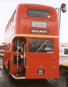
If you look at the plan of a London Routemaster, you'll see that the staircase is at the rear, at that the interior wall is curved, matching the curve of the exterior. You descend, first facing towards the rear, but then radidly turning to face towards the nearside. You can place your weight against the outside handrail, following the curve as you make your descent, working with the inertia of the forward-moving bus to keep you canted towards the side or rear of the bus all the time.

On the sleek Enviro400 the staircase runs towards the back of the bus for most of its length (my photograph shows an Enviro500 in Hong Kong; for a UK vehicle see here). You start your descent facing the offside, that is you are working against the inertia of the moving vehicle. The panelling meets at a 90° angle, so there is no curve to lean against to transition from facing offside to facing towards the rear. Now you have a straight drop, facing to the rear in front of you, with the inertia of the bus propelling you down it. There is a correspondingly sharp angle to the panelling and stairs at the bottom.

In short, in my opinion, the Routemaster stairs assist you in descending, the Enviro400’s actively work against a safe descent.

The photograph of the Alexander Enrivo 400 is from Wikipedia; the floor plans of the Routemaster from 73 urban journey [a bus blog]; information about Stagecoach Oxfordshire’s buses is from their website; the Hong Kong bus photograph is from www.statemaster.com ecyclopedia entry on the Enviro500; the link to the Enviro 400 interior images is to Alan O. Watkin’s site; the photograph of the rear of the Routemaster is from Ian Smith’s Bus Stop.

Warning: eBooks can seriously damage your poetry

Ideally, the text measure in a poetry book accommodates the normal length of a verse line. Shakespeare wrote relatively regular pentameters which require between 50 and 55 characters to the line. Don’t say that Kindle users haven’t been warned about the need to keep point sizes small to avoid turned lines. (Image above from the Mobipocket website, below Tschichold’s Penguin Shakespeare.)