 The New York Times satirizes its own election graphics here with an infographic that owes more to a wallpaper sample book than Isotype. (My favorites are Alaska and Washington.)
Paul Luna’s book, Typography: A Very Short Introduction, is published by Oxford University Press
Shall we join Canada?
 The New York Times satirizes its own election graphics here with an infographic that owes more to a wallpaper sample book than Isotype. (My favorites are Alaska and Washington.)
The Mad Men type spotter’s file
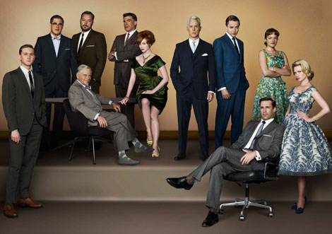
 If, like me, you are waiting anxiously for the next series of Mad Men (those frocks! those opening credits!) but want to check those niggling feelings you have about the anachronistic use of type in the series, then here is the website for you.
Helvetica in a NYC glass house
 This interesting-looking structure, with a system of underground heating and cooling, also sports some large scale Helvetica. The explanatory graphic in the New York Times is worth looking at, too. (The structural engineers are a British firm.)
Why lower-case letters may have saved civilization
 Pierre MacKay, of the University of Washington in Seattle, writes of the revolution in handwriting that occurred in the 800s in this week’s Times Literary Supplement:
‘Not only Latin and Greek, but Arabic as well underwent a profound transformation from majuscule and Coptic hands to minuscule or, as it is tellingly named in Arabic, naskhi (= copyists’) hands, which are less ornamental, but faster to produce, and usually take up less space.
‘The illustration that accompanies the review [in the 26 September 2008 issue of the TLS], of a fourth-century bible, shows majuscule Greek at its best, but a great deal of surviving majuscule is not open and rounded like this example but compressed horizontally to a point of seriously decreased legibility. A well-known inability of later readers to distinguish EIC from EK is one result of this compression. …
‘The two centuries preceding the ninth were not good times for books. War, natural disasters and decay continued their inroads on the majuscule heritage, but copyists were less and less active. The first chapter of Paul Lemerle’s Le Premier Humanisme byzantin paints a gloomy picture of literacy in that time, and things were no better in the Latin West and not much better in the Islamic Caliphate.
‘The invention of the three minuscules (including naskhi) should not be seen as causing the loss of the heritage from late antiquity, but rather as a response across three cultures to the realization that unless the copyists got to work fast, there might be nothing left to copy.’
The illustration,of a Carolingian minuscule from the Grandval Bible, Tours, c 840, is from Nicolete Gray, A history of lettering, p. 68
Talwin Morris and Reading
Two Bodleian exhibitions
The Original Frankenstein, 7 October 2008, Bodleian Library Proscholium
A special one-day display of Frankenstein manuscripts and related material.
A special one-day display of Frankenstein manuscripts and related material.
Vivian Ridler’s Christmas card collection, 28 November to 24 December 2008
This year Vivian Ridler, distinguished Printer to the University Press, Oxford from 1958 to 1978, celebrates his 95th birthday. This exhibition displays a fascinating selection of Christmas cards sent by printers and artists to Vivian and his late wife, the poet Anne Ridler, over a period of 60 years.
This year Vivian Ridler, distinguished Printer to the University Press, Oxford from 1958 to 1978, celebrates his 95th birthday. This exhibition displays a fascinating selection of Christmas cards sent by printers and artists to Vivian and his late wife, the poet Anne Ridler, over a period of 60 years.
Subscribe to:
Posts (Atom)