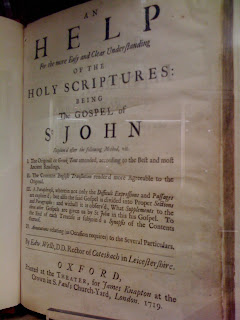
 What must have struck seventeenth-century readers as a very positive declaration (‘I think so’) strikes the modern reader as at best an equivocation, at worst absent-mindedness (‘I think so’).
Paul Luna’s book, Typography: A Very Short Introduction, is published by Oxford University Press
When typography doesn’t help
Careful use of typography should eliminate ambiguity. But it falls down when faced with the mind-set or expectations of the reader. Take this example from the 1662 service for the ordination of priests in the Church of England.
 What must have struck seventeenth-century readers as a very positive declaration (‘I think so’) strikes the modern reader as at best an equivocation, at worst absent-mindedness (‘I think so’).
 What must have struck seventeenth-century readers as a very positive declaration (‘I think so’) strikes the modern reader as at best an equivocation, at worst absent-mindedness (‘I think so’).
AV translators did not read Fowler – official!
The entry ‘which, that, who’ occupies five and a half dense columns in Fowler’s Modern English Usage. Boiled down, the ‘Warden of English’ claims that which is informative but non-defining, while that is defining. (‘The river, which is tidal, is dangerous'; ‘Rivers that are tidal are always dangerous’). But look at this presentation of the sermon on the mount from the AV:
 (Visulization by ManyEyes)
 (Visulization by ManyEyes)
Circling the square
Stan Rueker, of Humanities Visualization, visited the Department recently and showed, among other visualization tools, Mandala.
This lets you search an XML file and create collocations between words. To give you an example, I’ve loaded Book 1 of War and Peace, and looked for paragraphs that contain the names Natasha, Pierre, and Andrei. Mandala is presenting me with those that contain both Natasha and Pierre, and Pierre and Andrei.

Paul Stiff raised an interesting objection to Stan’s visualizations, namely the problem of the circle in data graphics. It’s much less easy to instantly assess the relative sizes of circles than it is to assess the relative sizes of squares. Below I offer examples from the ManyEyes site that I think support Paul’s point of view.


(While you are on the ManyEyes site, look at our own Gerry Leonidas as the subject of data visualization!
This lets you search an XML file and create collocations between words. To give you an example, I’ve loaded Book 1 of War and Peace, and looked for paragraphs that contain the names Natasha, Pierre, and Andrei. Mandala is presenting me with those that contain both Natasha and Pierre, and Pierre and Andrei.

Paul Stiff raised an interesting objection to Stan’s visualizations, namely the problem of the circle in data graphics. It’s much less easy to instantly assess the relative sizes of circles than it is to assess the relative sizes of squares. Below I offer examples from the ManyEyes site that I think support Paul’s point of view.


(While you are on the ManyEyes site, look at our own Gerry Leonidas as the subject of data visualization!
Subscribe to:
Comments (Atom)
