Diurnal obsolescence

What are we to make of the text that Barnes & Noble has chosen to use in the sample pages of its new ebook reader, the Nook. (Nook? As in Rookery Nook? Nookie Bear?) It is a passage from Italo Calvino’s Invisible Cities, in particular the city of Leonia. Leonia is the ultimate in consumer wastefulness – every day all its consumer products, both ephemeral and durable, are thrown out, only to be themselves replaced 24 hours later. The detritus surrounds the city like a range of mountains.

Are Barnes & Noble telling us something about the purchasing of books – that we need new ones every day, and should discard the old? Or the the Nook releases us from this fate, as we need not accumulate any physical books at all? Or has some subversive noted that each season will bring a newer, better ebook reader, so that the old ones can be discarded, indestructible, on to the growing waste-dumps of Leonia?

By the way, William Weaver’s translation is correctly ‘light bulbs’, not ‘bulbes’; ‘tubes’, not ‘rubes’, of toothpaste. And I think the strange use of bold and bold italic is supposed to show how you can highlight passages of text.

The text appears to be in a version of Monotype Amasis, but the italic is a sloped roman (we are told it can display five fonts). The Nook has the marketing advantage of being able to show covers from the Banes & Noble online store in colour because, as well as the epaper reading screen, there is a shallow conventional colour screen below.

‘I demand a serial comma!’

I haven’t got hold of a copy yet, but this volume is certainly on my must-read list.

‘Each year readers submit over three thousand grammar and style questions to the Q&A page at The Chicago Manual of Style Online. Some are arcane, some simply hilarious – and one editor, Carol Fisher Saller, reads every single one. All too often she notes a classic author–editor standoff over the ‘rights’ and ‘wrongs’ of prose styling: ‘This author is giving me a fit’. ‘I wish that I could just DEMAND the use of the serial comma’. ‘My author wants his preface at the end of the book. This seems ridiculous. I mean, it’s not a post-face’. In The Subversive Copy Editor, Saller suggests new strategies for keeping the peace. Emphasizing carefulness, transparency, and flexibility, she shows copy editors how to build trust and cooperation. One chapter takes on the difficult author; another speaks to writers directly. Throughout, the focus is on serving the reader, even if it means breaking ‘rules’ along the way.’

Trusting your designer

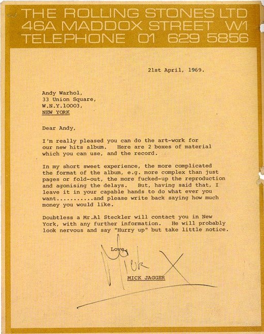
Matt Carey brought this letter from Mick Jagger to Andy Warhol to my attention – the kind we’d all like to receive!

The grey and grey book

Rob Waller spotted this article by Nicholson Baker (The Mezzanine, Double Fold) about the physical aspects of reading books and ebooks.

It’s not entirely negative, but here is his first impression of the Kindle’s typographic presence: ‘The problem was not that the screen was in black-and-white; if it had really been black-and-white, that would have been fine. The problem was that the screen was gray. And it wasn’t just gray; it was a greenish, sickly gray. A postmortem gray. The resizable typeface, Monotype Caecilia, appeared as a darker gray. Dark gray on paler greenish gray was the palette of the Amazon Kindle.’

Small subfusc cephalopod

Reading alumna Clair Georgelli’s site shows her books chronicling the adventures of a Little Black Squid: Polka Dot Design

Readers do notice

I was glad to read Philip Pullman’s review of Athanasius Kircher's Theatre of the World by Joscelyn Godwin in today’s Guardian draws attention to its design: ‘But the main thing to say about this book is that it is a stupendously good piece of design. Every illustration is reproduced in exactly the right place; the captions are superbly apt and very clearly signalled; the sidebars are tactfully positioned and filled with exactly the right amount of information. The paper is heavy and rich, and properly bound. The author and the publisher [Thames & Hudson] have taken real, prolonged, and exhaustive pains to make a beautiful book, and succeeded.’