How hand compositors justified lines
This is the clearest explanation I have seen of the sequence of spacing adjustment, the visual basis for the adjustments, and the fine gradations possible in hand-set metal composition.
COMPOSITOR’S WORK IN PRINTING
As setting proceeds, the compositor will separate his words with a potentially variable space, i.e. one that may have to be increased or decreased when justifying the line. This space may be either a thick or a middle space. When the Style of the House demands close spacing, it is often wise to make the middle space the variable rather than the thick space which is commonly used as the standard and this is particularly applicable when faces of a narrow set width are used.
 Having filled the measure with the maximum number of words and decided whether the next word has to be hyphenated or whether it will commence the succeeding line, the compositor first reads the contents of the line from the copy, corrects if necessary, and then proceeds to justify the words. In modem practice, it is generally considered preferable to decrease rather than increase spacing and to avoid any irregular word spacing, as is seen in the practice of placing an em quad or extra space after a full point at the end of a sentence.
The aim in justification must be to secure spacing that is visually equal and this requires that the actual space placed between words is often unequal. In decreasing space, alteration is first made between commas and letters that have round or inclined strokes like c, o, r, v, w and y, and of these, the last three (v, w and y) have the effect of imparting additional visual space to a greater extent than the others. Combinations of letters have to be watched; there is, for example, greater visual space between y followed by v than there is between y followed by k. Decreases in spacing are made lastly between successive ascenders and certain descenders; there is far less visual space between letters like d followed by l or by b than there is between combinations such as y and v.
These aspects of visual spacing make it evident that when increasing word spacing, the alteration is first made to the space between ascenders like d, h and I and the letters m and n, and that the last combinations to be increased are those of v, w, y and also the comma and full point.
In normal text composition, it is the aim of the compositor not to use a space larger than an en quad and to become seriously concerned should he reach two thick spaces. On the other hand, he is always faced with the possibility of a compromise in endeavouring to avoid successive lines commencing with the same word or ending with a hyphen. Yet a craftsman cannot escape the fact that extremely wide spacing results in very unpleasant ‘rivers’ of white space, that peculiar effect which arises from the spaces in successive lines falling under each other and thus spoiling the effect of a type page.
When decreasing spacing, the sequence followed will be to change the thick spaces to middle spaces, and then to thin spaces. Very occasionally, the range may be extended beyond this by employing hair spaces after a comma, full point or parenthesis but the technique must be employed with care.
In increasing spacing, a middle space may be altered to a thick and from this to two thin spaces. Next follows a thin and a middle space and then two middle spaces (or an en quad). In going beyond the en quad, many compositors overlook the fact that the next combination in increased thickness is a thick and a thin space which is very slightly thicker than an en quad but not so wide as a thick space with a middle space - the combination usually used. The next higher combinations are a middle and two thin spaces and then two thick spaces. Finally, there are combinations of a thin and two middle spaces and then a thick with two thin spaces.
Using the theoretical division of the em quad into 60 units, the following table shows the comparative thickness of space combinations used to increase word spacing:
 20 thick [C]
24 two thins [E+E]
27 thin and middle [E+D]
30 en (two middles) [B=D+D]
32 thick and thin [C+E]
35 thick and middle [C+D]
39 middle and two thins [D+E+E]
40 two thicks [C+C]
42 en quad and thin [B+E]
44 thick and two thins [C+E+E]
From this table it will be seen that the differences between certain combinations are very subtle and enable very fine adjustments to be made. Some of these slight increases are extremely useful when the compositor has justified a line that is slightly ‘soft’ in the stick and needs only minute adjustment to make it tight.
It is part of the compositor’s technique to be thoroughly familiar with the range of space combinations so that the full scope of increases comes instinctively and it is not necessary for him to have to adopt a ‘trial and error’ method and so slow up his production. The learning of the correct scope of justification is achieved as part of the slow and deliberate setting practice by the beginner and provides yet another reason why any aspect of speed must be divorced from initial attempts to gain the correct technique.
It has often been stated that in the setting of poetry, the words are equally spaced and this is often taken to mean that the spaces employed must be of equal thickness. Yet the same rules of visual spacing apply to poetry as to any other composition and, in point of fact, as the lines are running free, the inequalities between letter combinations are given greater emphasis than they are in normal solid matter.
The Style of the House will specify whether space is to be placed before certain points of punctuation and the compositor will follow this (except where the space is on the body of the letter) yet he must also employ letter spacing where it is required - as in lines of capitals and put in the spaces as he sets and not wait for the letter spacing to be marked in the proof.
H. W. Larken. 2/e, 1964. London: Staples Printers Ltd., pp. 91–3.
The illustrations are by Tom Hughes, from Introduction to printing: the craft of letterpress by Herbert Simon. London: Faber, 1968.
COMPOSITOR’S WORK IN PRINTING
As setting proceeds, the compositor will separate his words with a potentially variable space, i.e. one that may have to be increased or decreased when justifying the line. This space may be either a thick or a middle space. When the Style of the House demands close spacing, it is often wise to make the middle space the variable rather than the thick space which is commonly used as the standard and this is particularly applicable when faces of a narrow set width are used.
 Having filled the measure with the maximum number of words and decided whether the next word has to be hyphenated or whether it will commence the succeeding line, the compositor first reads the contents of the line from the copy, corrects if necessary, and then proceeds to justify the words. In modem practice, it is generally considered preferable to decrease rather than increase spacing and to avoid any irregular word spacing, as is seen in the practice of placing an em quad or extra space after a full point at the end of a sentence.
 The aim in justification must be to secure spacing that is visually equal and this requires that the actual space placed between words is often unequal. In decreasing space, alteration is first made between commas and letters that have round or inclined strokes like c, o, r, v, w and y, and of these, the last three (v, w and y) have the effect of imparting additional visual space to a greater extent than the others. Combinations of letters have to be watched; there is, for example, greater visual space between y followed by v than there is between y followed by k. Decreases in spacing are made lastly between successive ascenders and certain descenders; there is far less visual space between letters like d followed by l or by b than there is between combinations such as y and v.
These aspects of visual spacing make it evident that when increasing word spacing, the alteration is first made to the space between ascenders like d, h and I and the letters m and n, and that the last combinations to be increased are those of v, w, y and also the comma and full point.
In normal text composition, it is the aim of the compositor not to use a space larger than an en quad and to become seriously concerned should he reach two thick spaces. On the other hand, he is always faced with the possibility of a compromise in endeavouring to avoid successive lines commencing with the same word or ending with a hyphen. Yet a craftsman cannot escape the fact that extremely wide spacing results in very unpleasant ‘rivers’ of white space, that peculiar effect which arises from the spaces in successive lines falling under each other and thus spoiling the effect of a type page.
When decreasing spacing, the sequence followed will be to change the thick spaces to middle spaces, and then to thin spaces. Very occasionally, the range may be extended beyond this by employing hair spaces after a comma, full point or parenthesis but the technique must be employed with care.
In increasing spacing, a middle space may be altered to a thick and from this to two thin spaces. Next follows a thin and a middle space and then two middle spaces (or an en quad). In going beyond the en quad, many compositors overlook the fact that the next combination in increased thickness is a thick and a thin space which is very slightly thicker than an en quad but not so wide as a thick space with a middle space - the combination usually used. The next higher combinations are a middle and two thin spaces and then two thick spaces. Finally, there are combinations of a thin and two middle spaces and then a thick with two thin spaces.
Using the theoretical division of the em quad into 60 units, the following table shows the comparative thickness of space combinations used to increase word spacing:
 20 thick [C]
24 two thins [E+E]
27 thin and middle [E+D]
30 en (two middles) [B=D+D]
32 thick and thin [C+E]
35 thick and middle [C+D]
39 middle and two thins [D+E+E]
40 two thicks [C+C]
42 en quad and thin [B+E]
44 thick and two thins [C+E+E]
From this table it will be seen that the differences between certain combinations are very subtle and enable very fine adjustments to be made. Some of these slight increases are extremely useful when the compositor has justified a line that is slightly ‘soft’ in the stick and needs only minute adjustment to make it tight.
It is part of the compositor’s technique to be thoroughly familiar with the range of space combinations so that the full scope of increases comes instinctively and it is not necessary for him to have to adopt a ‘trial and error’ method and so slow up his production. The learning of the correct scope of justification is achieved as part of the slow and deliberate setting practice by the beginner and provides yet another reason why any aspect of speed must be divorced from initial attempts to gain the correct technique.
It has often been stated that in the setting of poetry, the words are equally spaced and this is often taken to mean that the spaces employed must be of equal thickness. Yet the same rules of visual spacing apply to poetry as to any other composition and, in point of fact, as the lines are running free, the inequalities between letter combinations are given greater emphasis than they are in normal solid matter.
The Style of the House will specify whether space is to be placed before certain points of punctuation and the compositor will follow this (except where the space is on the body of the letter) yet he must also employ letter spacing where it is required - as in lines of capitals and put in the spaces as he sets and not wait for the letter spacing to be marked in the proof.
H. W. Larken. 2/e, 1964. London: Staples Printers Ltd., pp. 91–3.
The illustrations are by Tom Hughes, from Introduction to printing: the craft of letterpress by Herbert Simon. London: Faber, 1968.
History is circular shock!
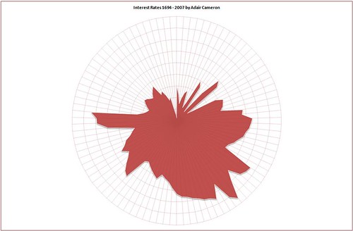 This graphic, based on Guardian data, seems to prove that James Joyce was right, and that time ‘brings us by a commodius vicus of recirculation back to Howth Castle and Environs.’
I also prefer to have my axes labelled …
A teaching style for our MA courses?
 Sarod musician Ali Akbar Khan was taught by his father: ‘As vocal music forms the basis of all Indian classical music, Ali Akbar was made to spend hours practising the sargams, sol-fa passages, and taans, musical figures. He was never allowed out of the room until his father was satisfied that he had got them right. Percussion and talas, time measures, he learned from his uncle, Fakir Aftabuddin. As [Ravi] Shankar wrote: “Ali Akbar told me he had been compelled to practise for 14 to 16 hours every day, and there were times when Baba tied him to a tree for hours and refused to let him eat if his progress was not satisfactory.” ’


Subscribe to:
Posts (Atom)